CASE STUDY
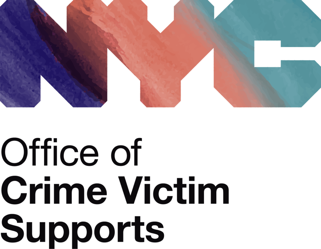
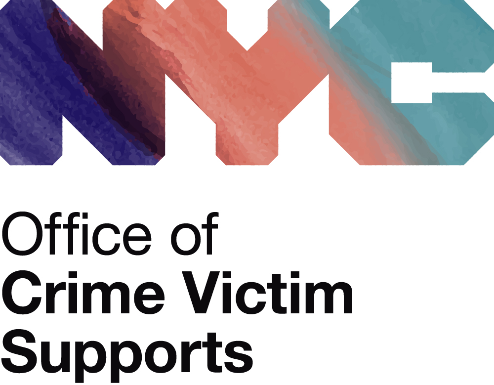
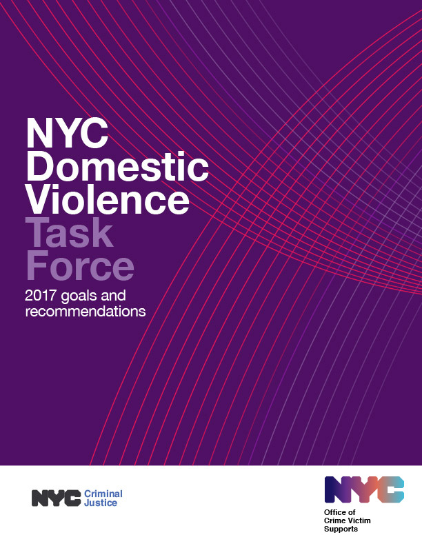
NYC Office of Crime Victim Supports
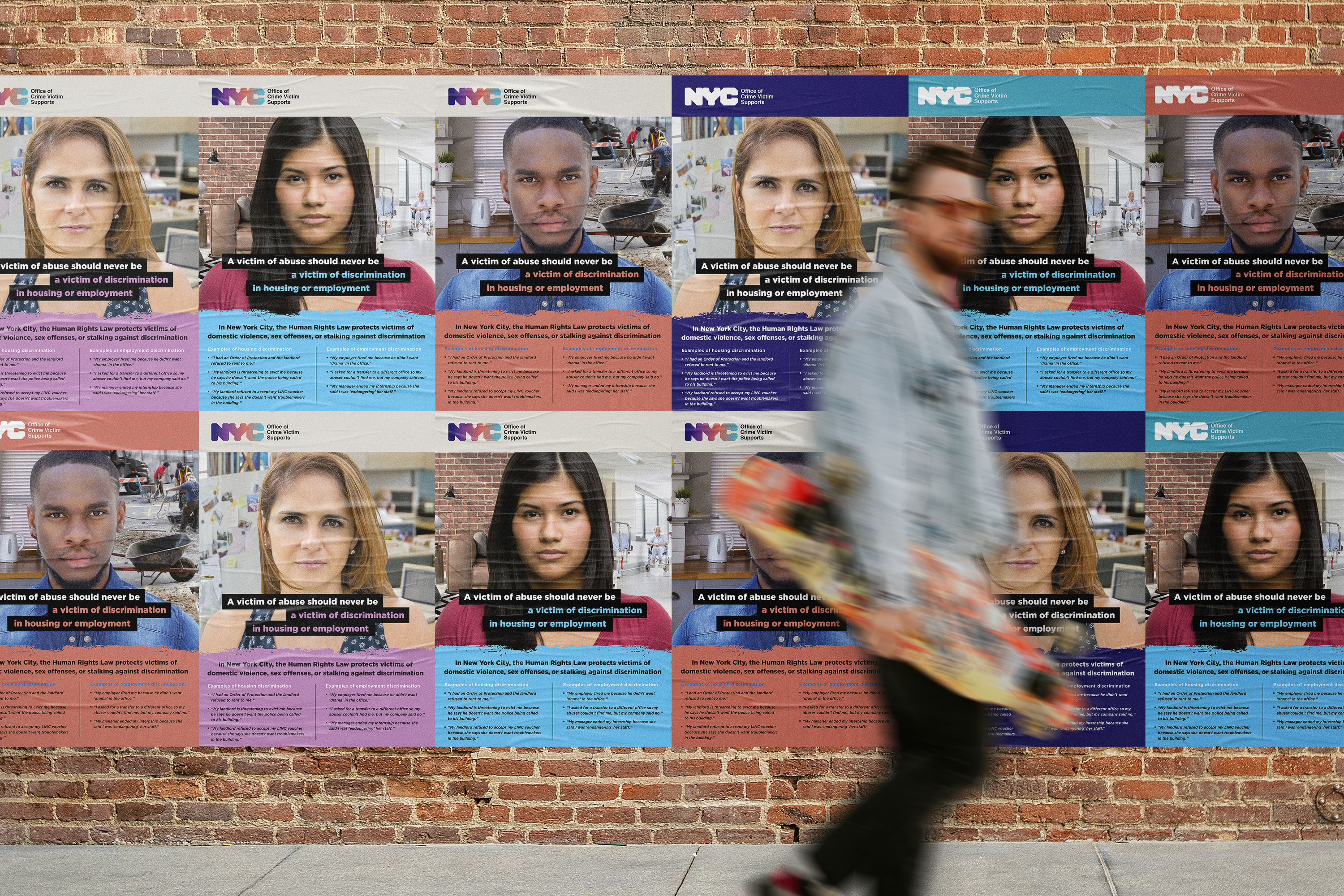
Services Rendered
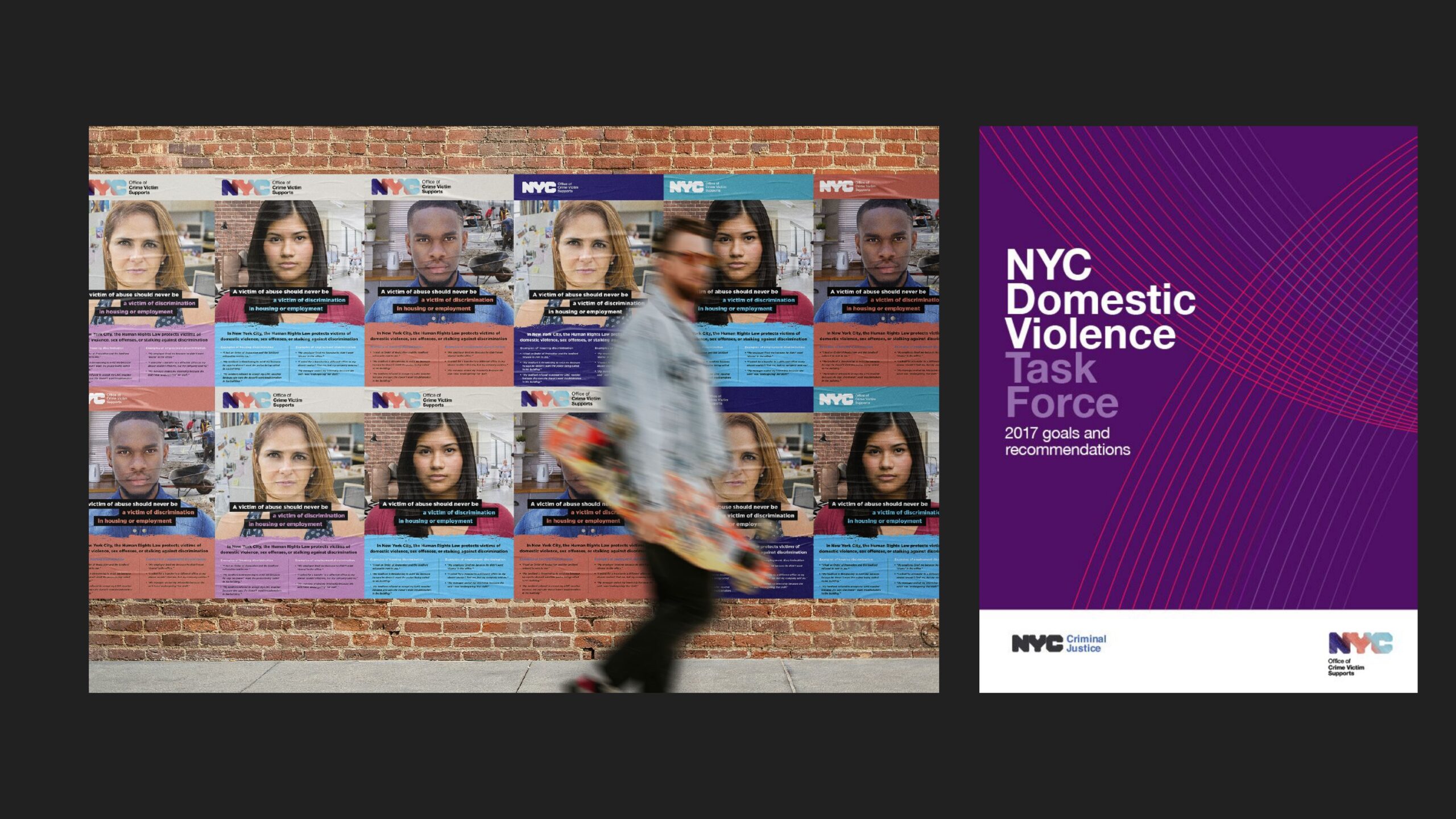
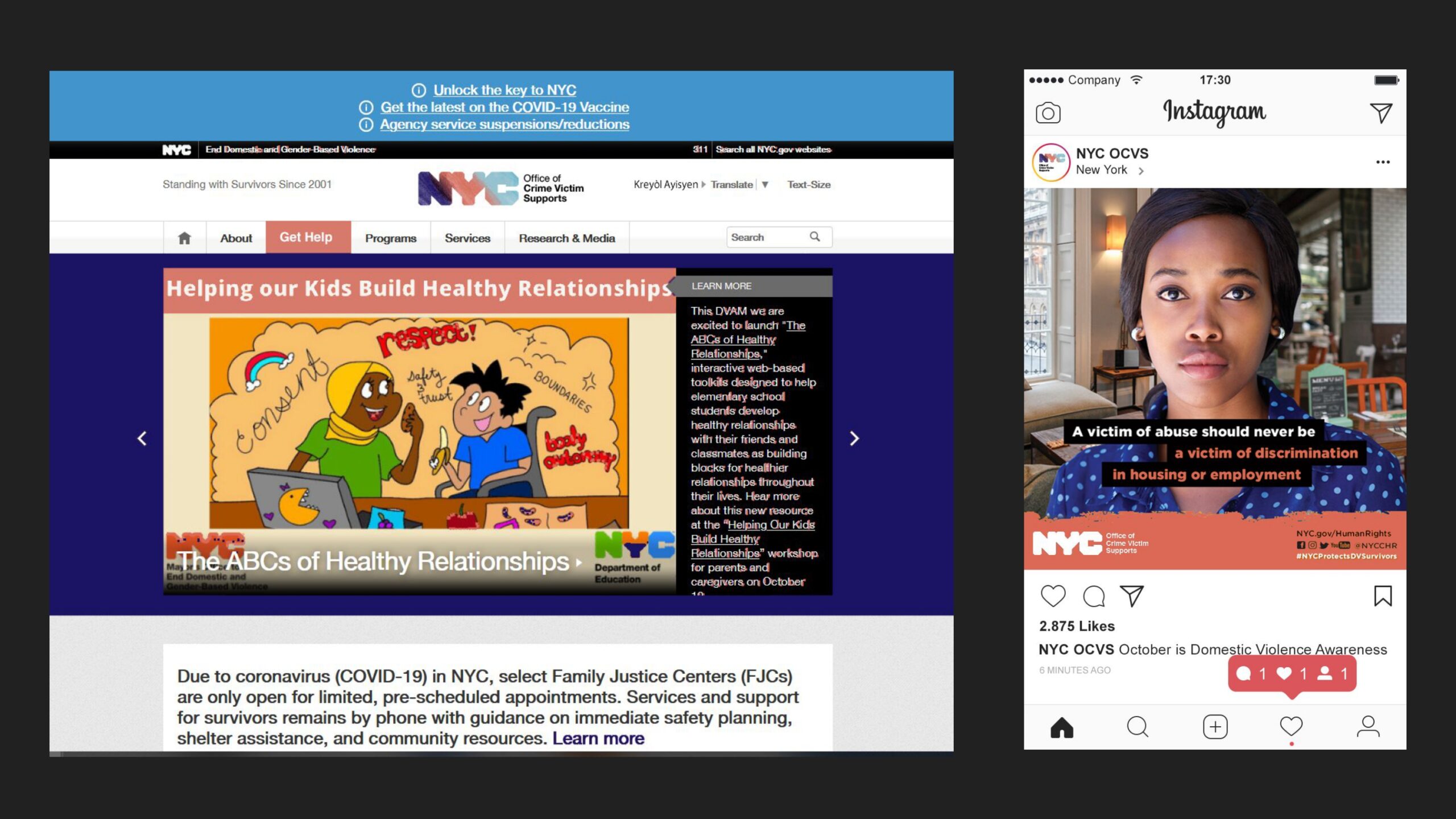
- Branding
- Graphic Design
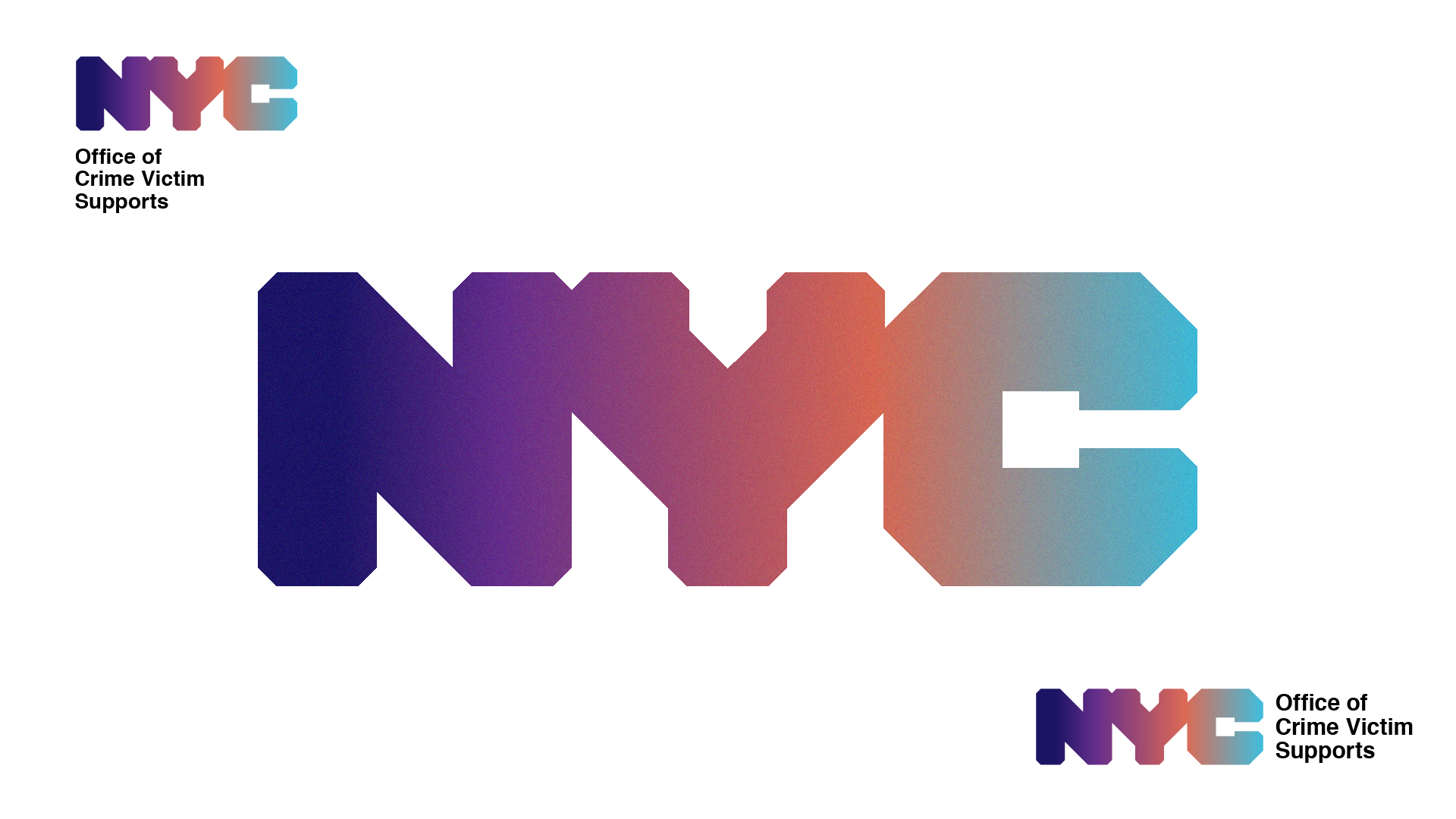
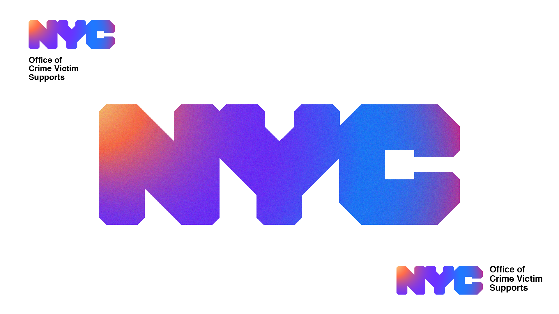
- Logo Design
- Design Documents & Mockups
Summary
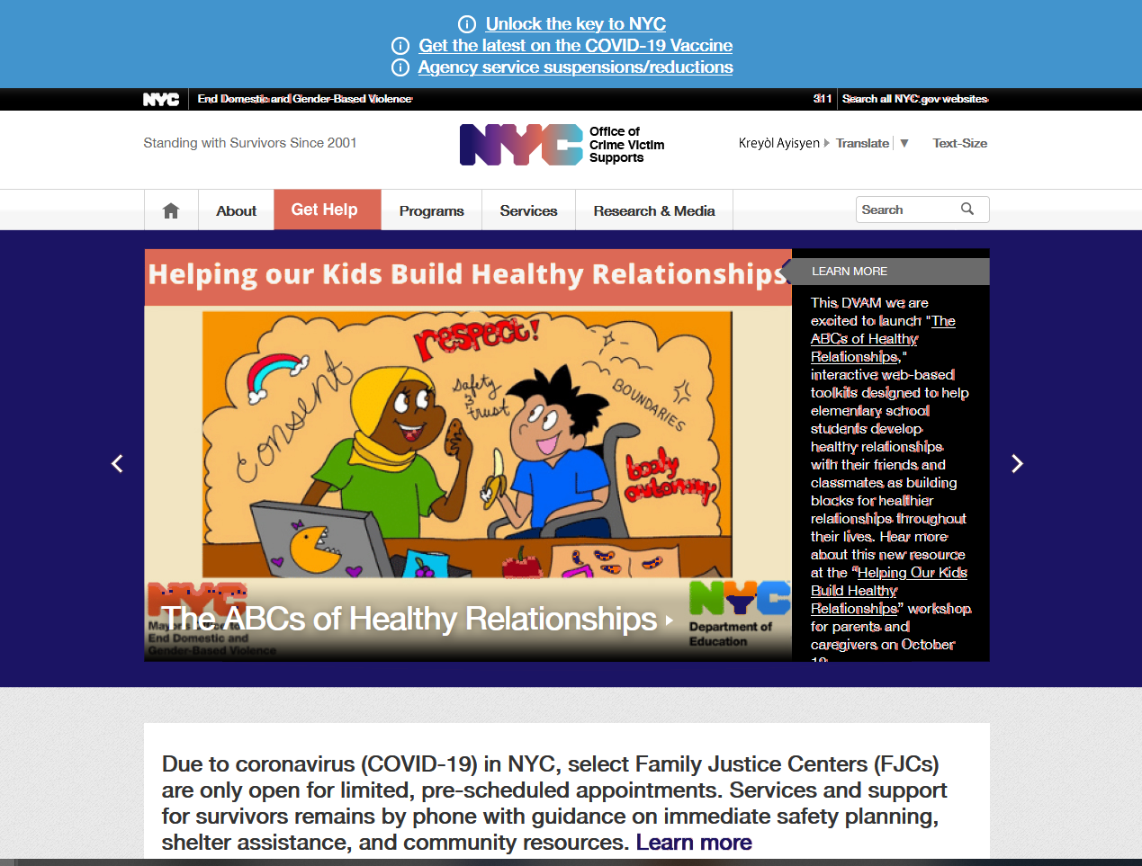
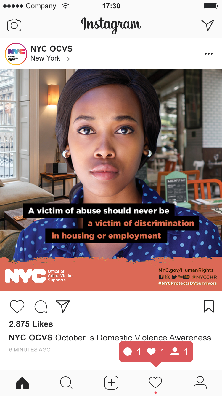
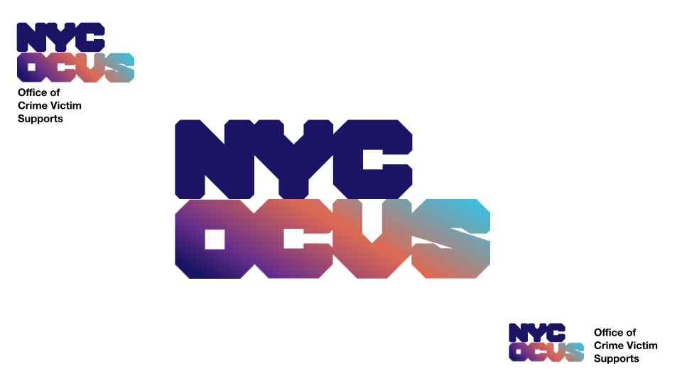
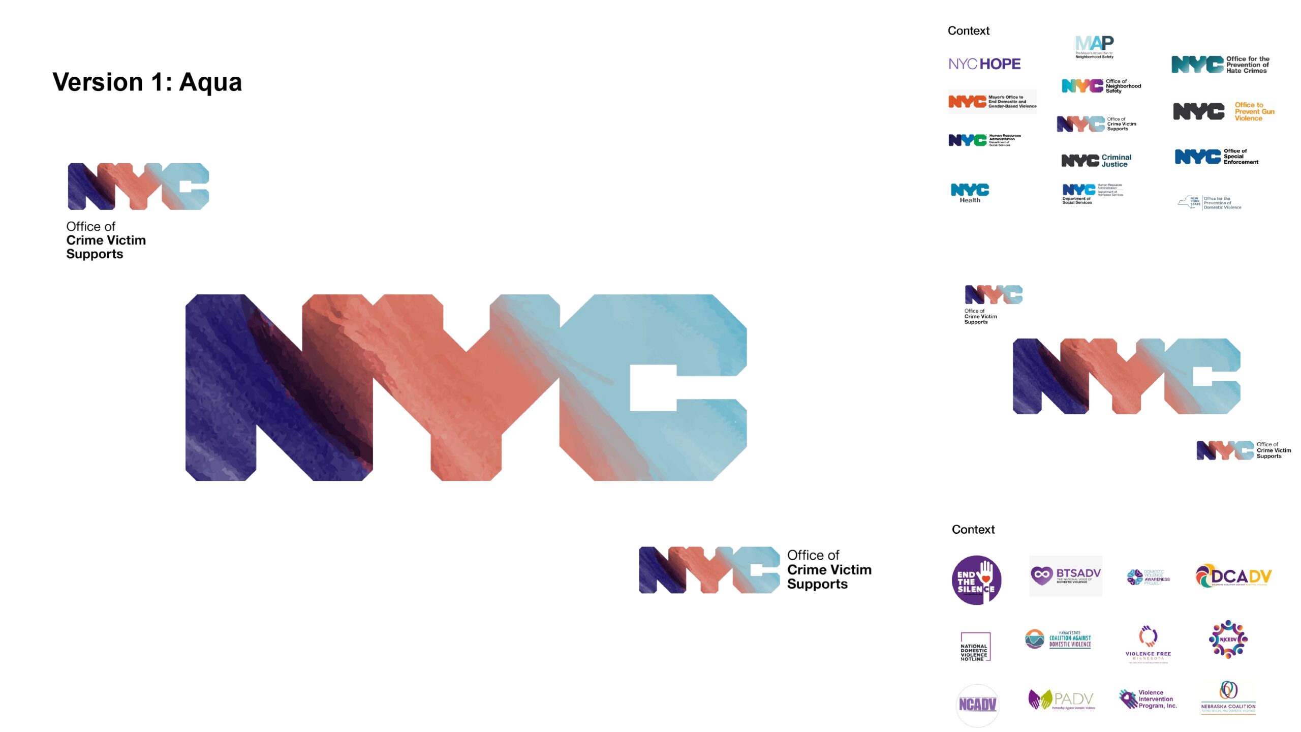
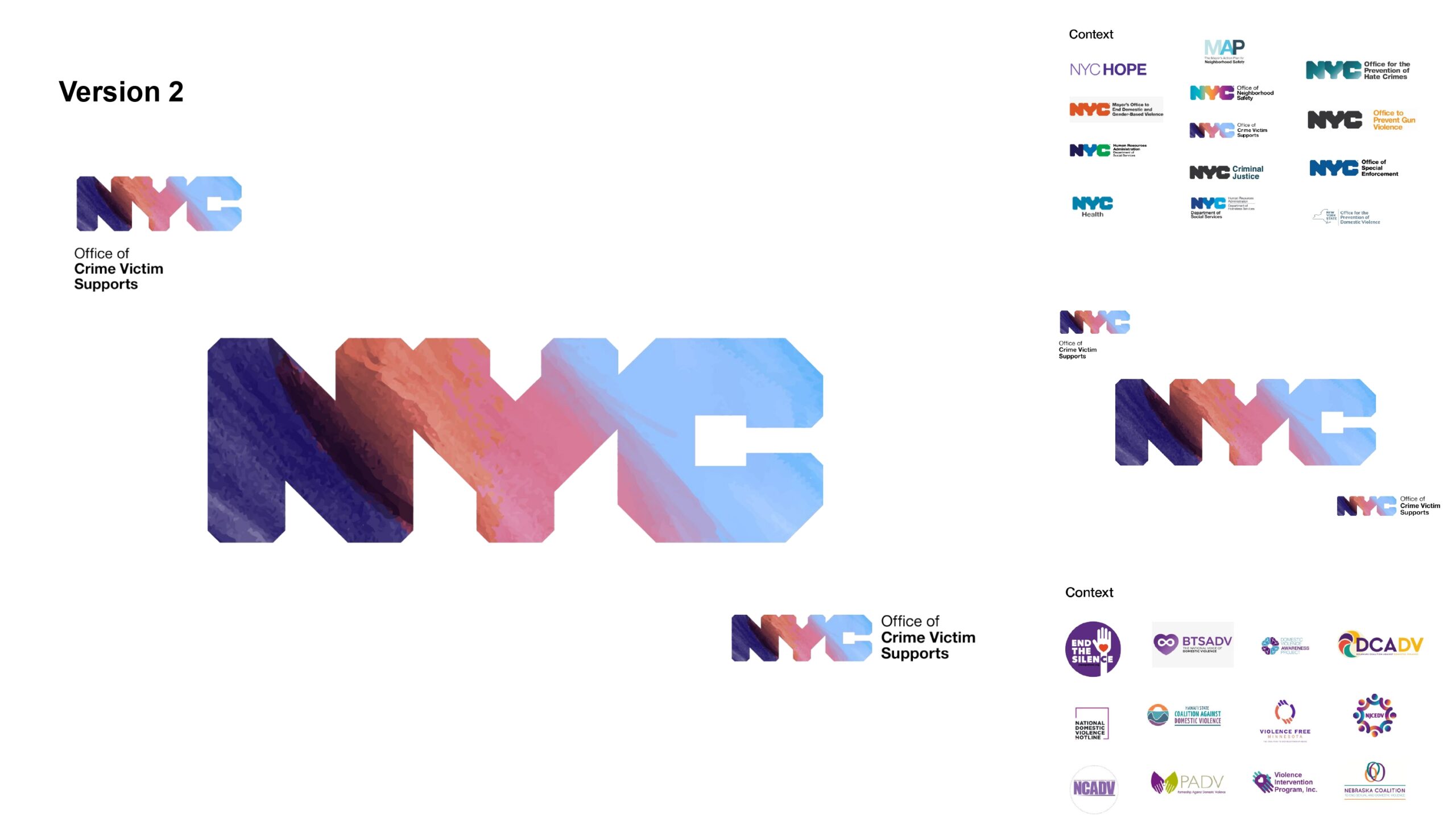
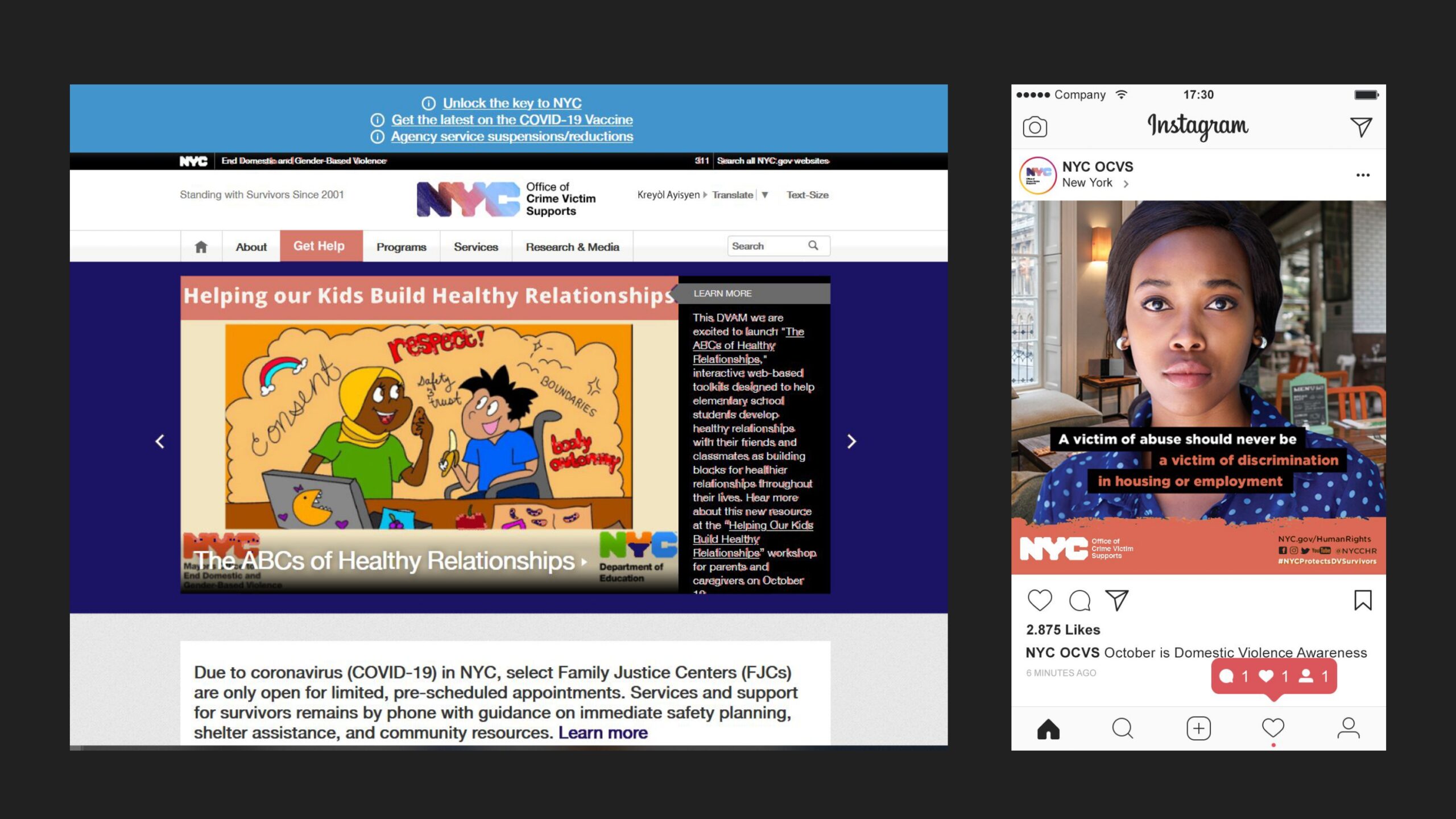
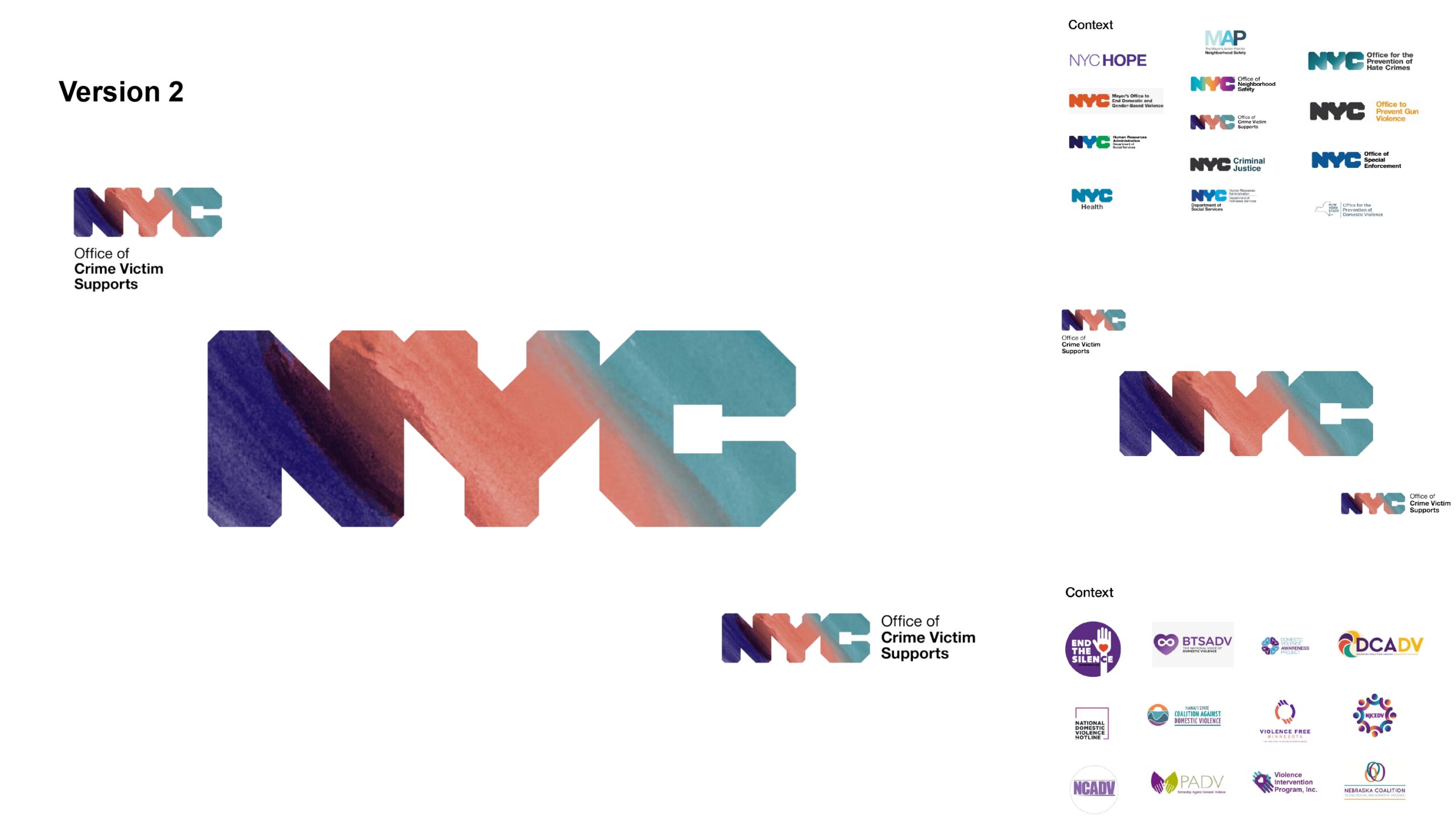
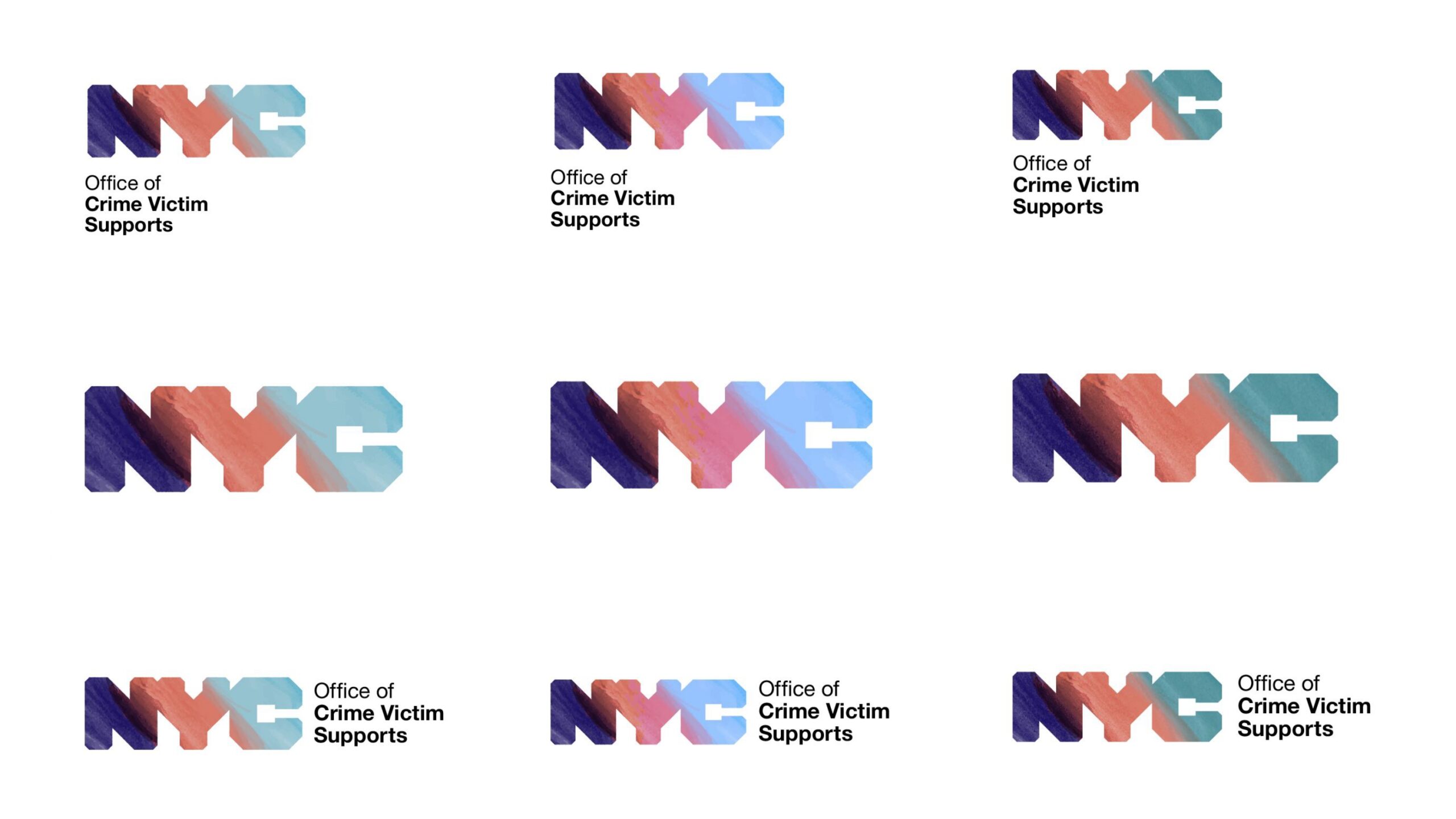
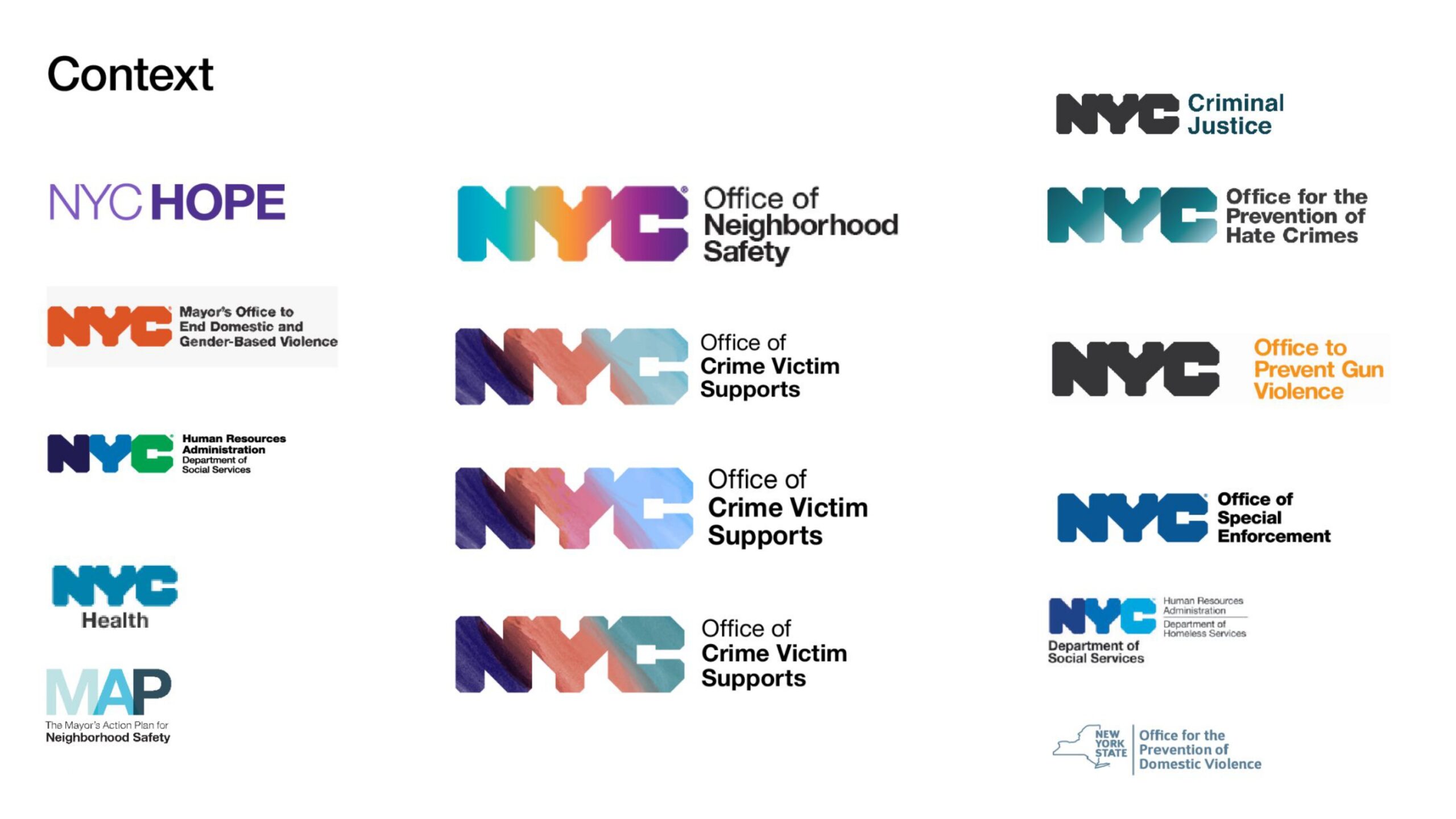
The Office of Crime Victim Supports (OCVS) is the first stand-alone municipal office of its kind in the country. Embedded in the Mayor’s Office of Criminal Justice, OCVS takes a holistic approach to victim services, coordinating existing services to support New York City residents impacted by crime.
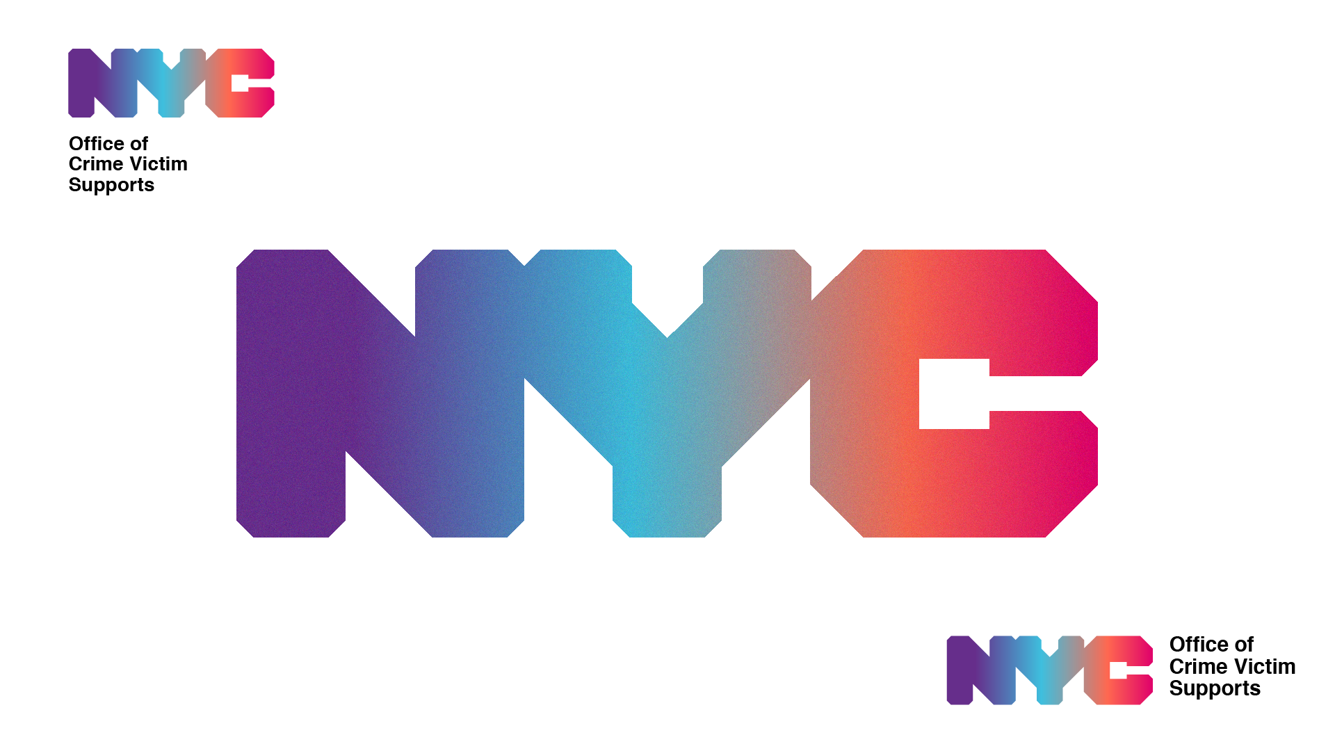
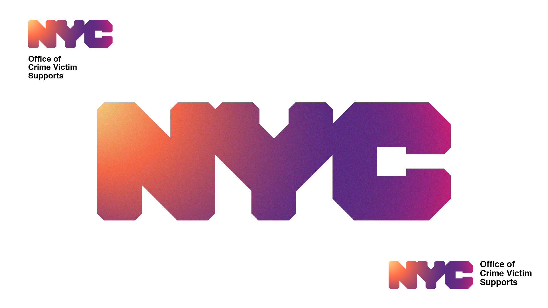
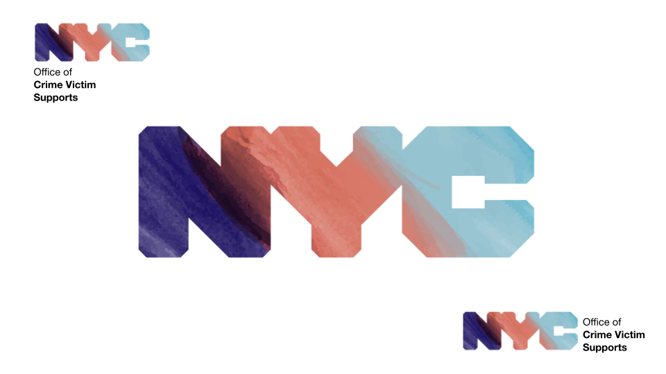
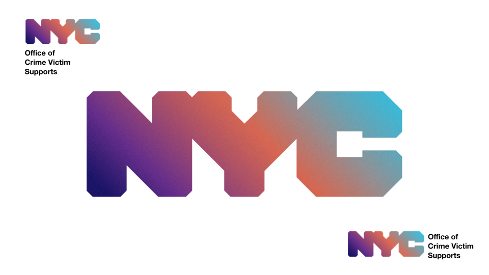
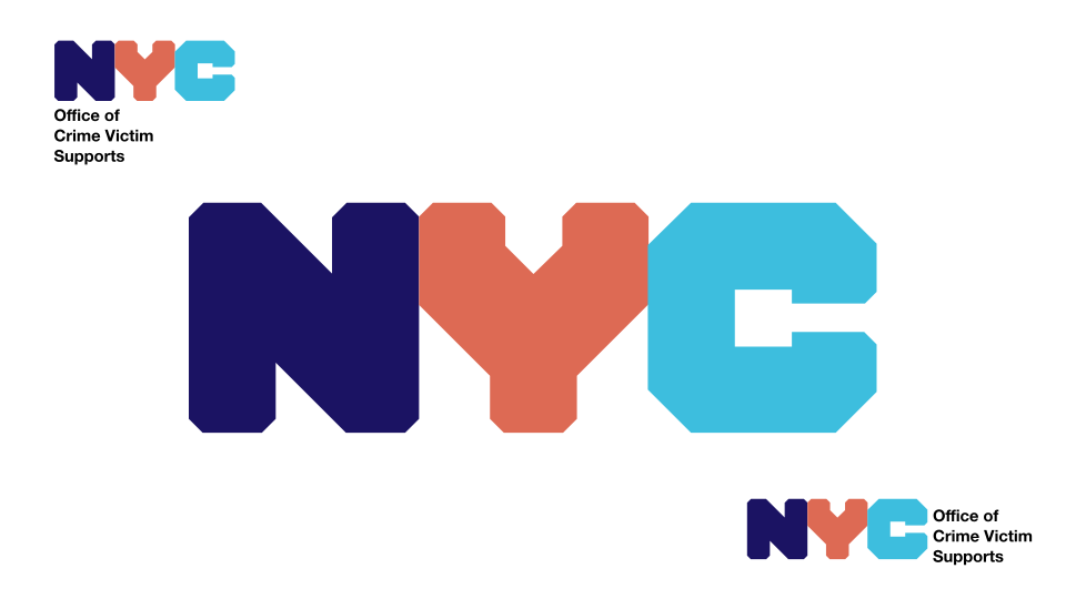
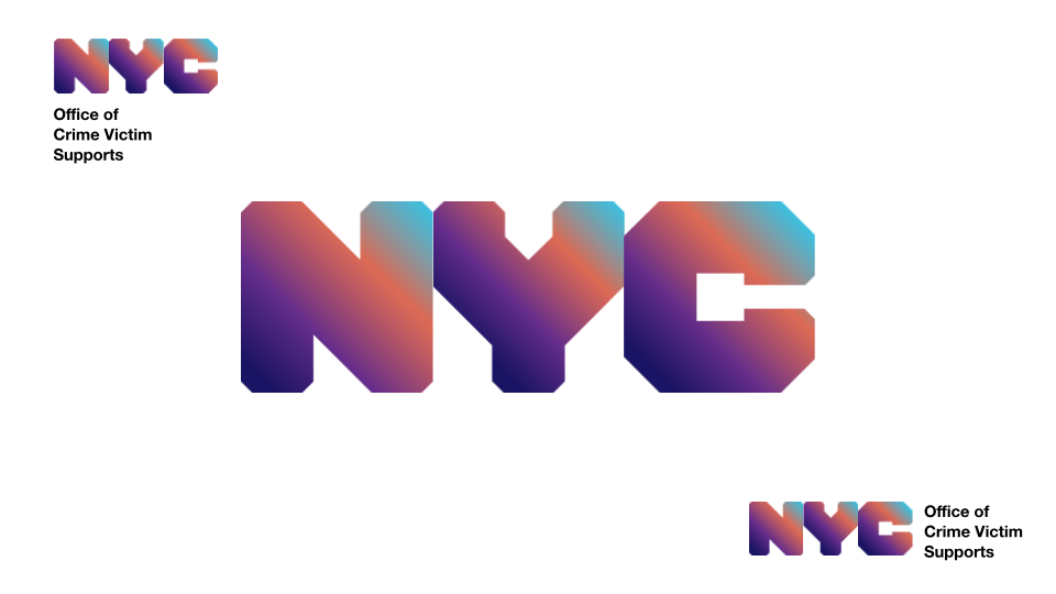
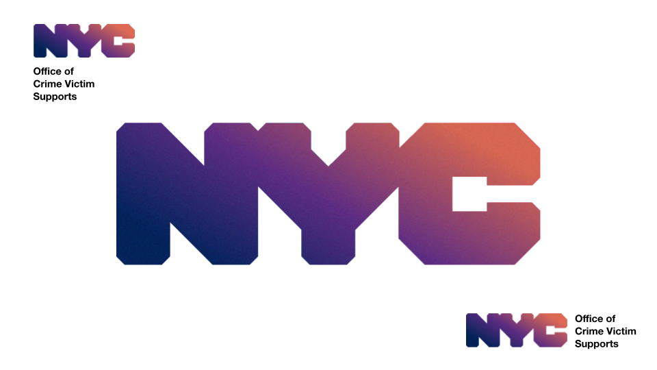
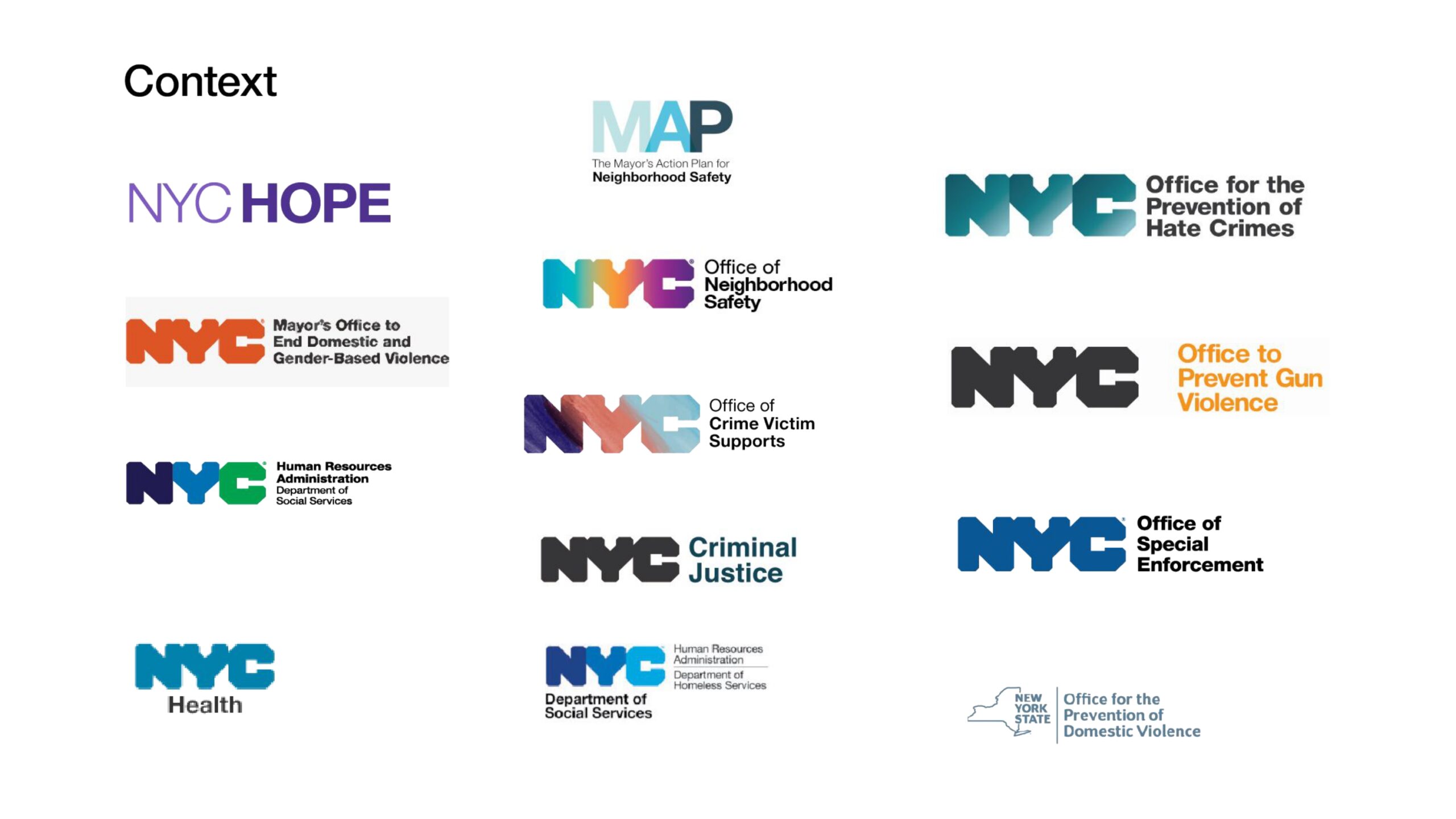
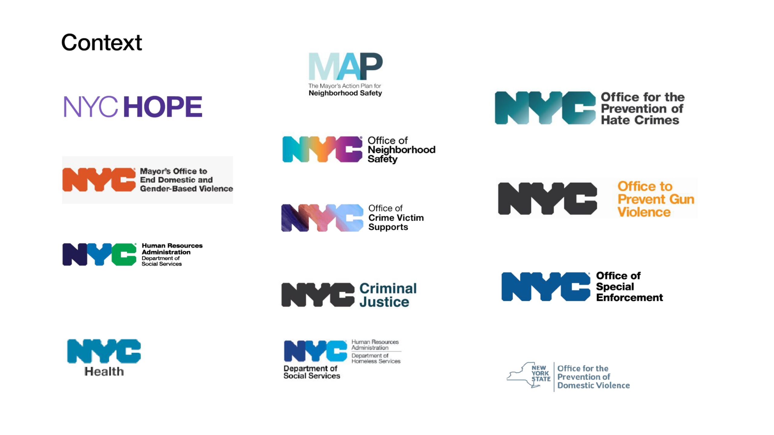
I was tasked with creating their logo and brand identity using the NYC design system but incorporating their own design language and core values


