The Challenge
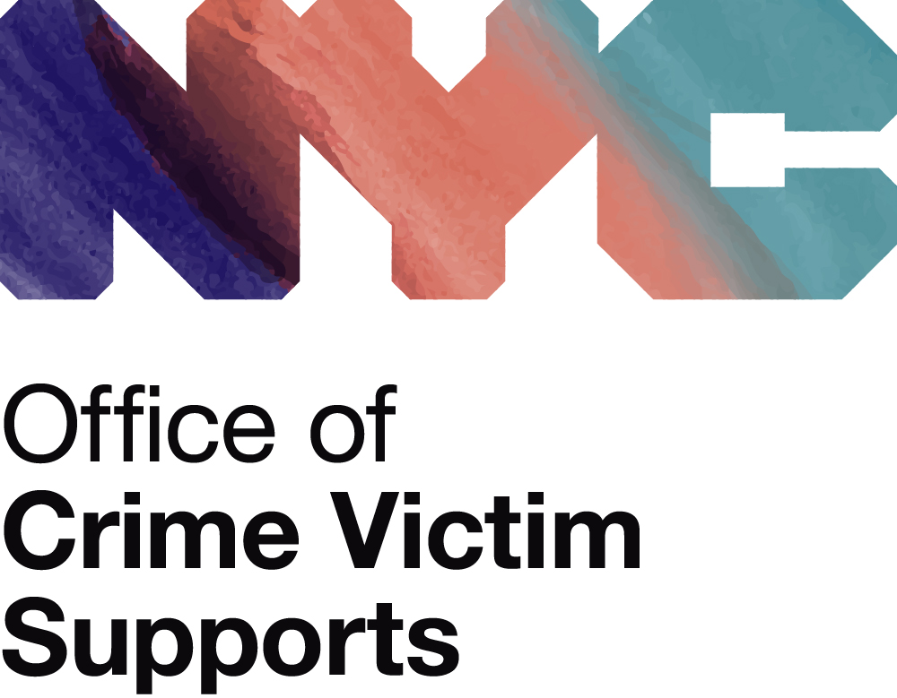
The Office of Crime Victim Supports (OCVS) needed a logo that showed they were a combination of 3 offices & initiatives: The Mayor’s Office to Combat Domestic Violence, The Mayor’s Office to End Domestic and Gender-Based Violence and The Mayor’s Office of Criminal Justice. It was decided early on in the process that they wanted to use the colors, purple, orange and blue to showcase that.
The Process
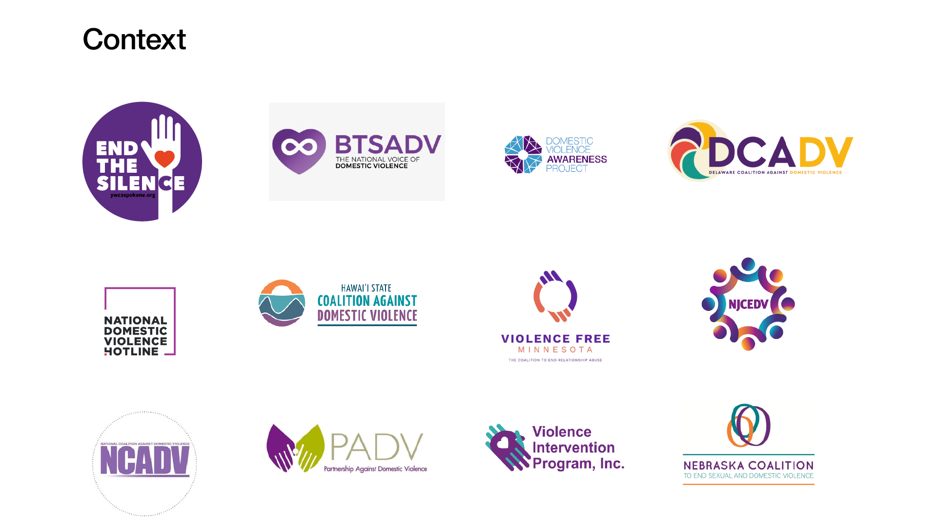
After conducting thorough consultations with OCVS, I commenced the research process. My main objectives were to understand the current landscape and design language. I gathered logos and marketing materials for organizations related to intimate partner violence and domestic violence. I wanted to make sure I was being thorough and to avoid any biases
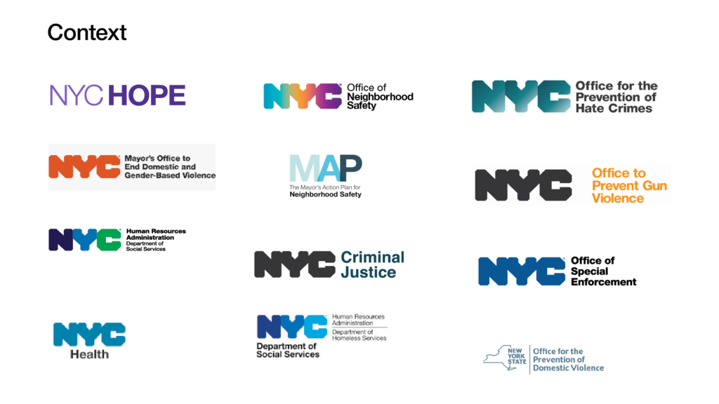
Contextually, all NYC logos follow the design document set forth by NYC & Company– the official marketing & tourism organization for the City of New York. I wanted to understand the likely context that the logo would appear next to official government organizations
After research, I decided to iterate several versions to decide on color scheme and get approval. Crucially, I needed to make sure I provided enough options so that the logo and its colors could convey the tone that they envisioned their department to be.
Solutions
Phase 1
For phase 1, I iterated several options based on their chosen color palette. The first 4 had their palette but in different levels of energy and gradient configurations. The last 2 were different palette versions to be simpler or more inclusive.
Typically, I don’t like presenting so many options but this was helpful for 2 main reasons.
- I wanted this to be highly collaborative. It got them to think of possibilities and they needed to decide on the tone of their messaging
- I’m a cis male who has been lucky enough to not need these services. I wanted to defer to their expertise as much as possible and overcome my biases as much as possible
Phase 2
Initially, they signed off on the first option immediately. The color scheme matched what they were looking for and the jewel and earth tones conveyed the tone they wanted.
However, due to the newly launched Office of Neighborhood Safety, they were concerned the logo was too similar.
Phase 2 is mostly a rethink on how to still remain true to the color palette but distinct enough from the Office of Neighborhood Safety
I played around with different configurations but the concept I honed in the most on was the first one.
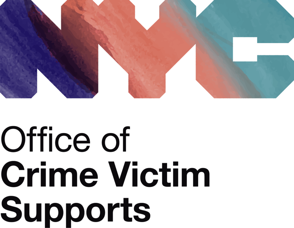
My thought process was that gradients seemed too impersonal so I wanted to add a human touch to it by painting their palette in watercolors. The extra painted texture and the soft brush strokes gave it an extra layer of compassion that I believe is vital to support services. It would also further make their department stand out amongst the other offices and initiatives
Phase 3
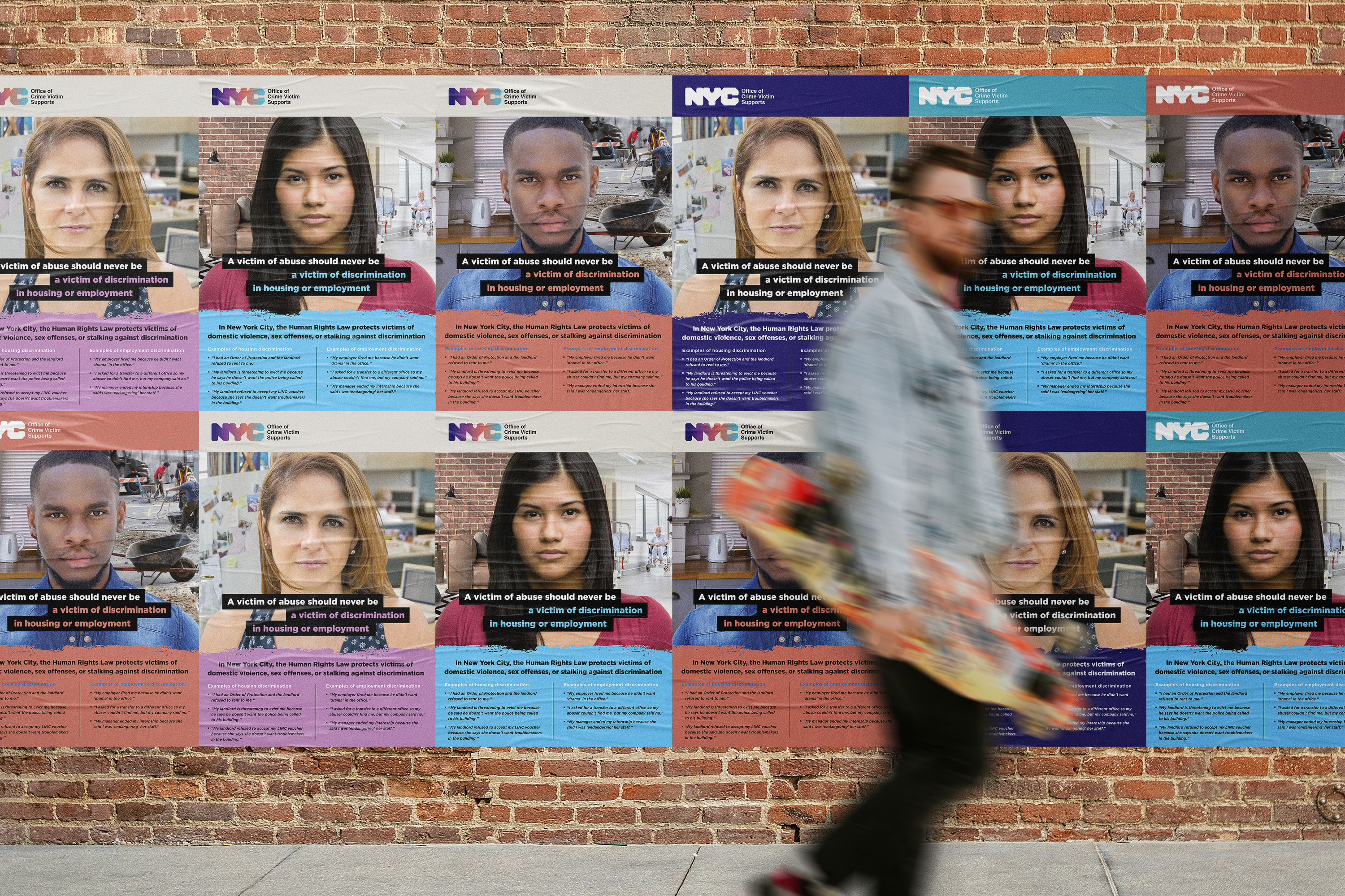
They loved the painted version so for the final phase and final approval, I wanted to provide extra context to see it in action. The 3 versions are mostly slight adjustments to saturation to either make it more saturated, jewel-toned or earth-toned
Final Version
They loved and approved the last version. The final step was to vectorize textures, perpare different versions for print, web and socials and prepare brand guidelines
