The Challenge
This website was extremely challenging for 3 main reasons:
The first being our website was slated to launch in less than a month. This was to coincide with the change in mayors.
The second was that this department was completely new and was the combination of 3 different organizations & departments. As it was in its infancy, there was a lot of discussion as to what the new form of the organization would actually be and approval would be difficult
The third is that this project was meant as a companion piece to several documentary shorts that were not yet completed. As such, the content for the website was also not completed which made design and content needs a very fast moving target
I am extremely grateful for my mentor, Christiana, whose guidance and prior engagement with the departments heavily influenced the direction for the entire project. Her initial design document for their logo development defined tone and direction that cut through the approval process.
The Process
As the time for execution was very short, my process cycle was fast paced. I limited my data collection to our existing properties and consultation with ONS.
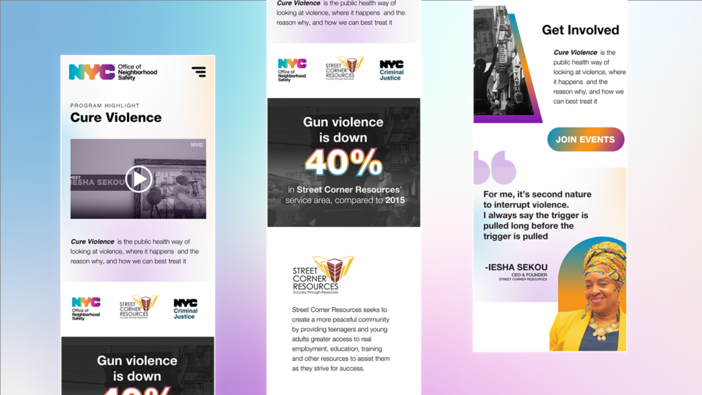
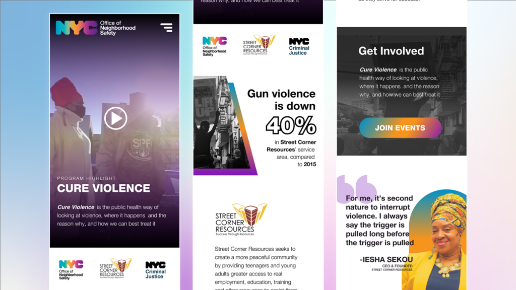
I created several modular designs and components on Figma that could get approval before content was made. As there was a large amount of content needed, I collated copy for snippets from pre-existing pages and isolated quotes from advanced screenings of the documentary
Solutions
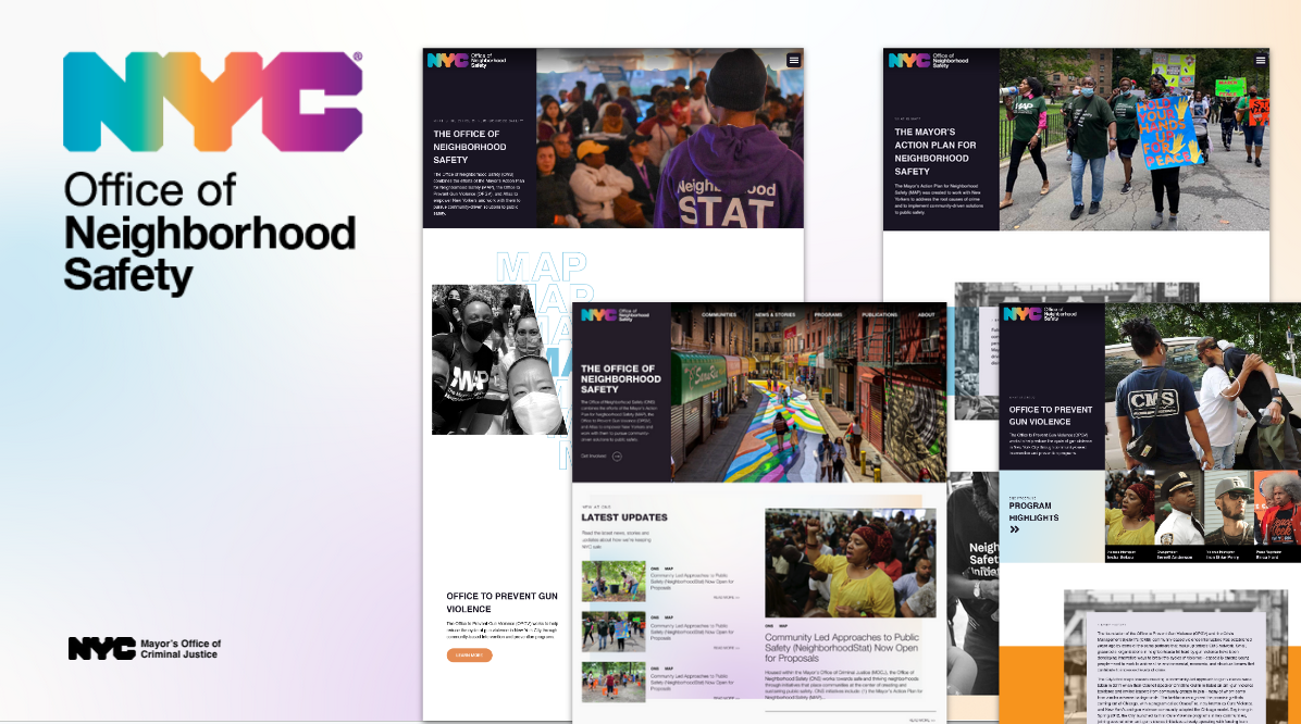
Tonally, the ask was to be more energetic and fresh than the rest of our web properties. This gave me a bit more freedom to inject more recent web trends into the project but I kept typography and general sections clean and consistent with WCAG standards and web patterns.
Once Figma prototypes got approval, I switched over to our staging website to cut down on iteration time. I created the base templates for the theme. I pre-loaded, cached and optimized images and video
Results
The entire process took 1 month, culminating in the launch of the new website in December 2021.
Currently, phase 2 is being worked on for deployment
Showcase


