The Challenge
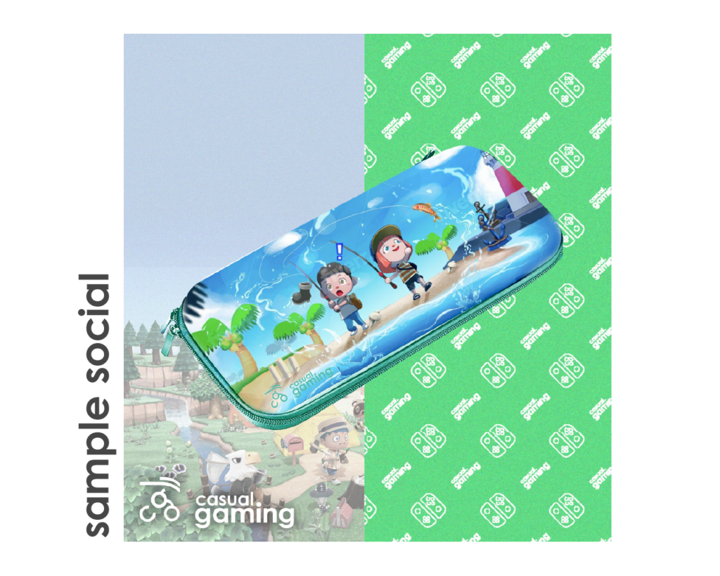
The client wanted a logo that looked friendly and approachable for their initial product launch for their line of Animal Crossing switch cases. The launch was to coincide with a social media campaign that was targeting Animal Crossing micro influencers
After our initial consult of business goals, brand values and aesthetics, I began the research process
The Process
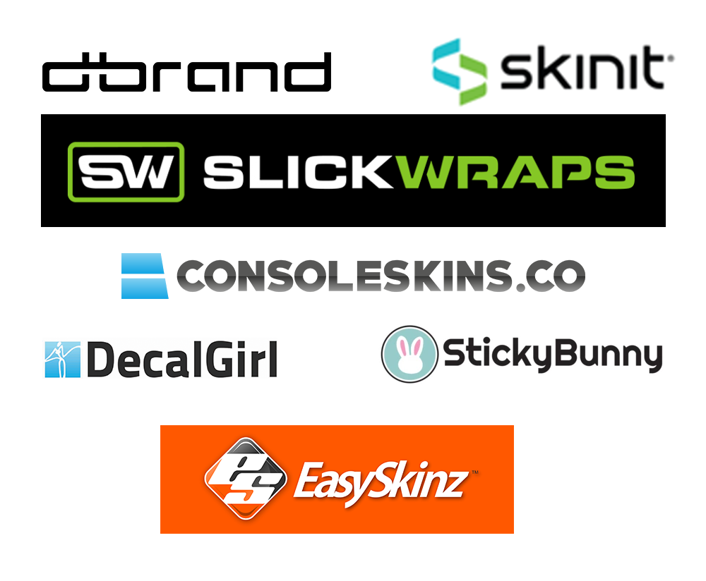
I conducted an initial market and competition research into the console skin and gaming merchandise niche.
San serifs and futuristic fonts were common themes. The market design language was very similar to PC gaming aesthetics
Because the entire initial run of product was envisioned as an Animal Crossing accompaniment line, I wanted to do a market assessment for that area as well to key in on their audience
According to Iwata, 56% of Animal Crossing players are female with some versions such as Pocket Camp reaching as high as 80% female. The age demographic of the game is solidly in the 18-35 age bracket
Because of this difference from the general gaming populace, I wanted to cater to the demographic while still being fairly universal. I deep dove into the animal crossing communities and studied cottage core references
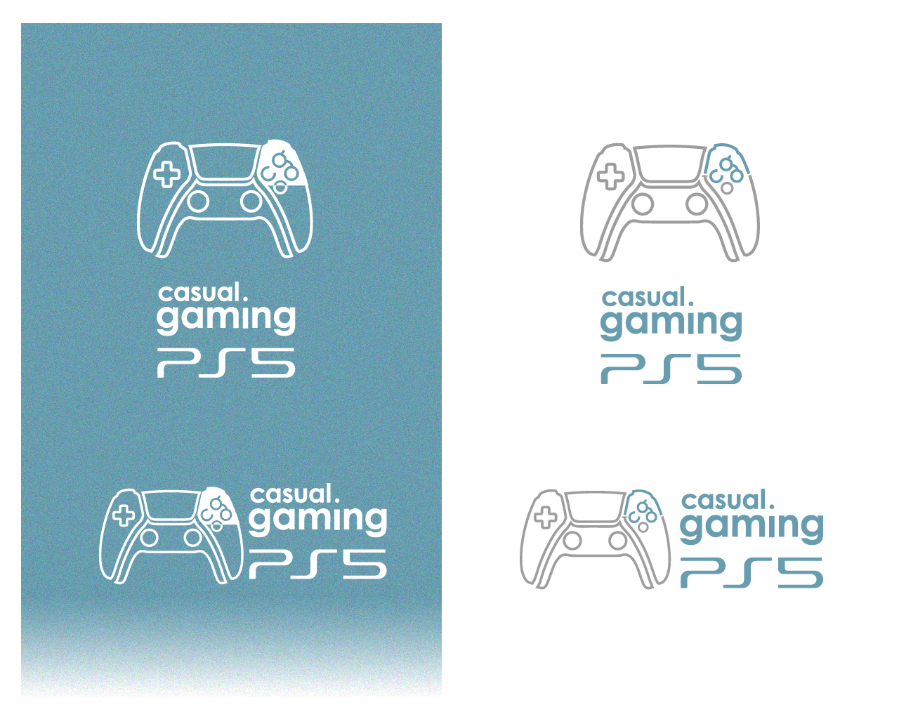
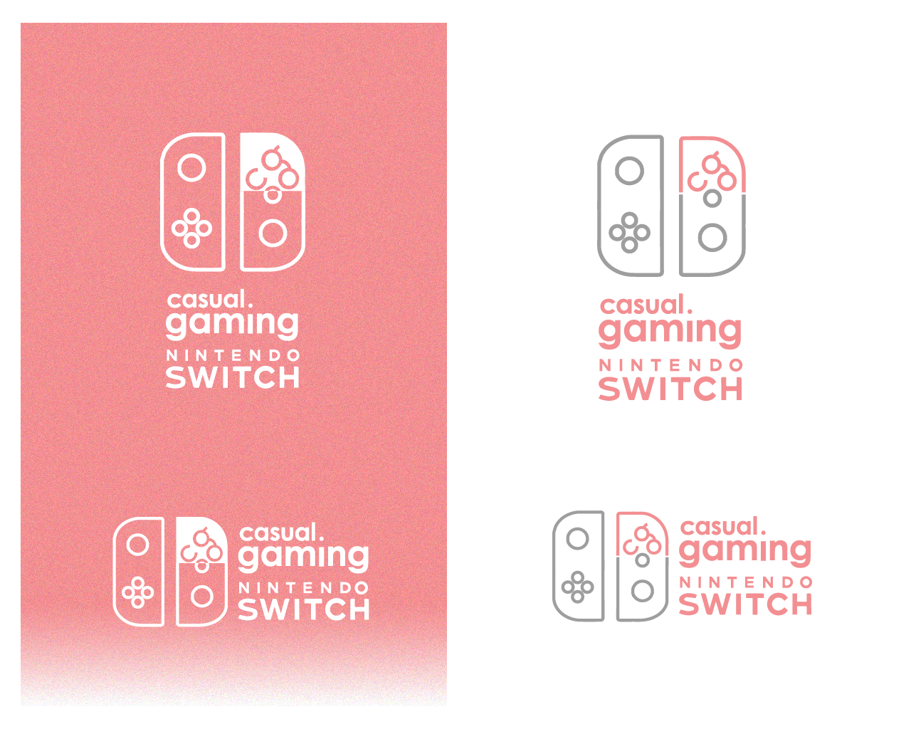
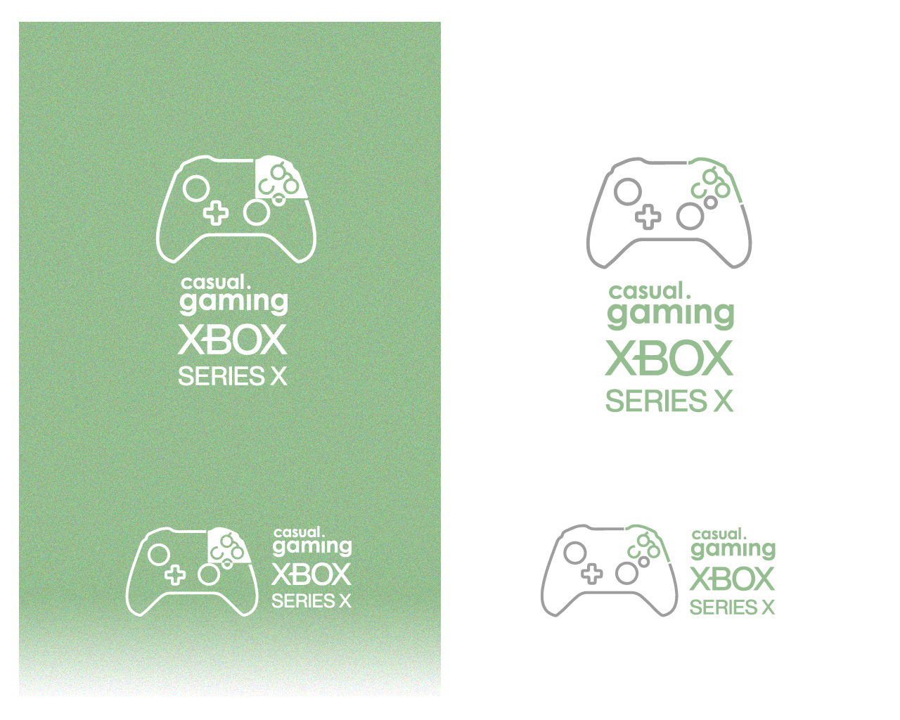
Logo Contexts
Solutions
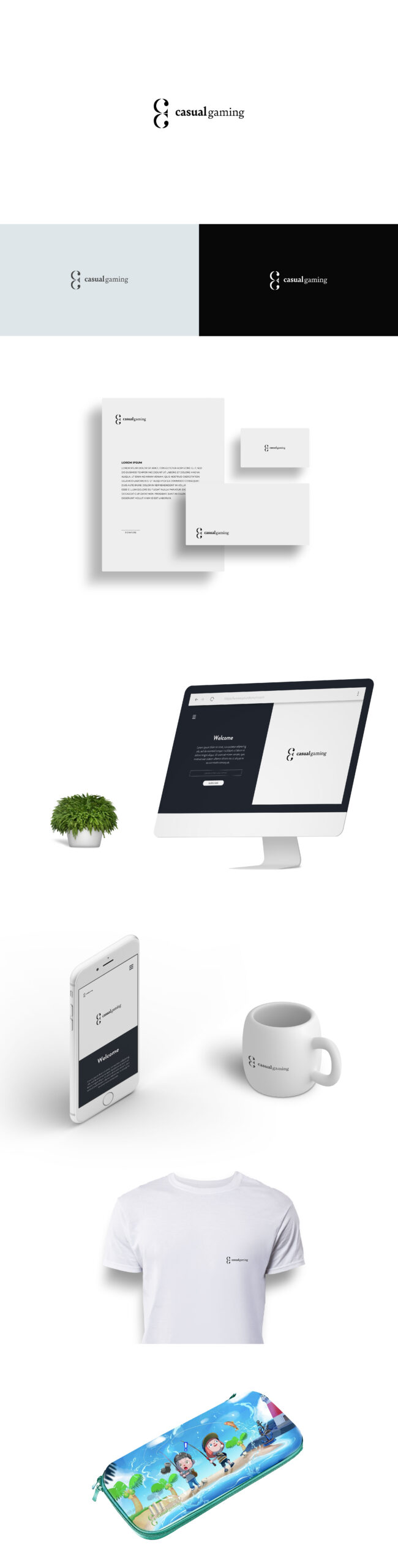
I wanted to explore some serif fonts as it would make them stand out in the marketplace and the general market trend back in 2020 was leaning more into serifs especially for female led brands.
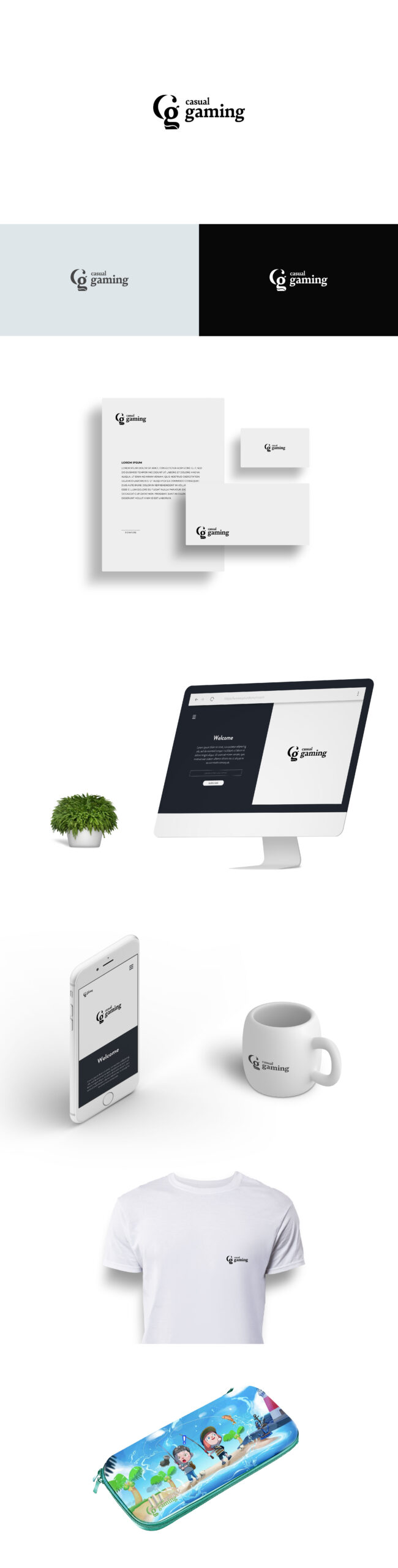
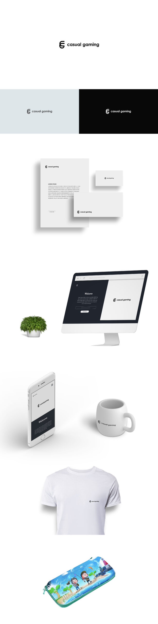
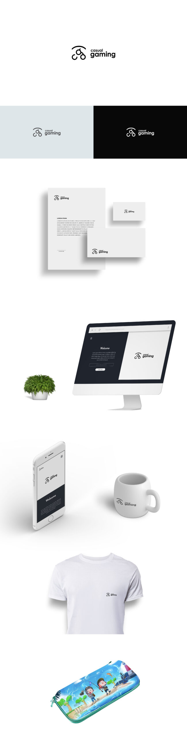
I developed 3 logomarks that hit upon their core values with the last being hyperfocused on Animal Crossing. The core business plan was still in flux whether they would develop beyond the niche, so I wanted to provide different options and flexibility if they decided to focus on the niche
Next, I wanted to do explorations on the gaming market at large. I wanted the logo to be reminiscent of the current logos out there but still distinct and friendly.
The first option is an exploration into a brand that would be flexible enough to be on PC gaming accesories like logitech.
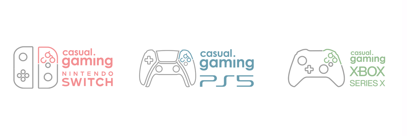
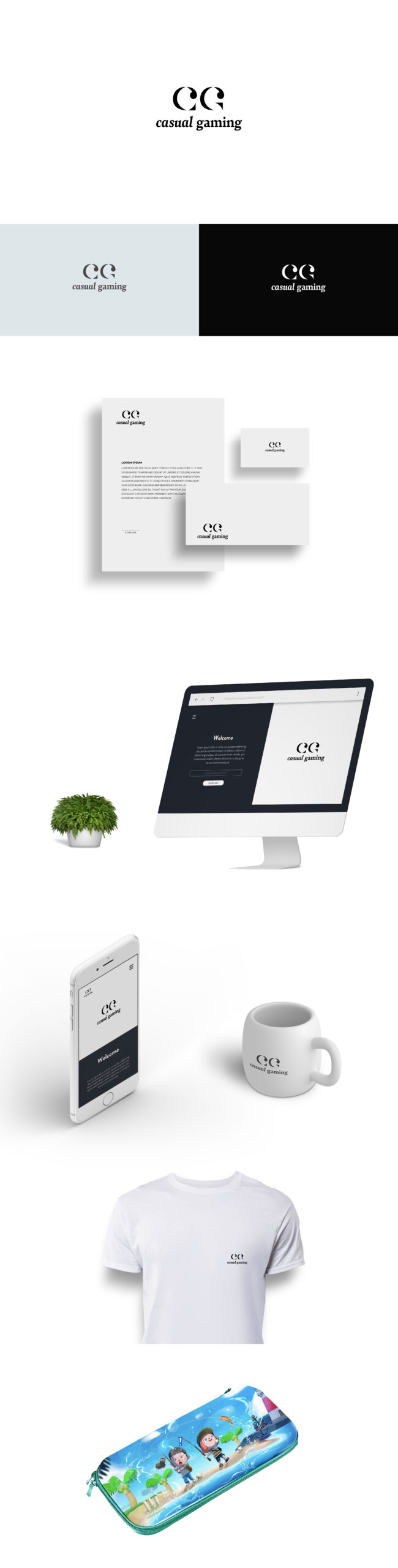
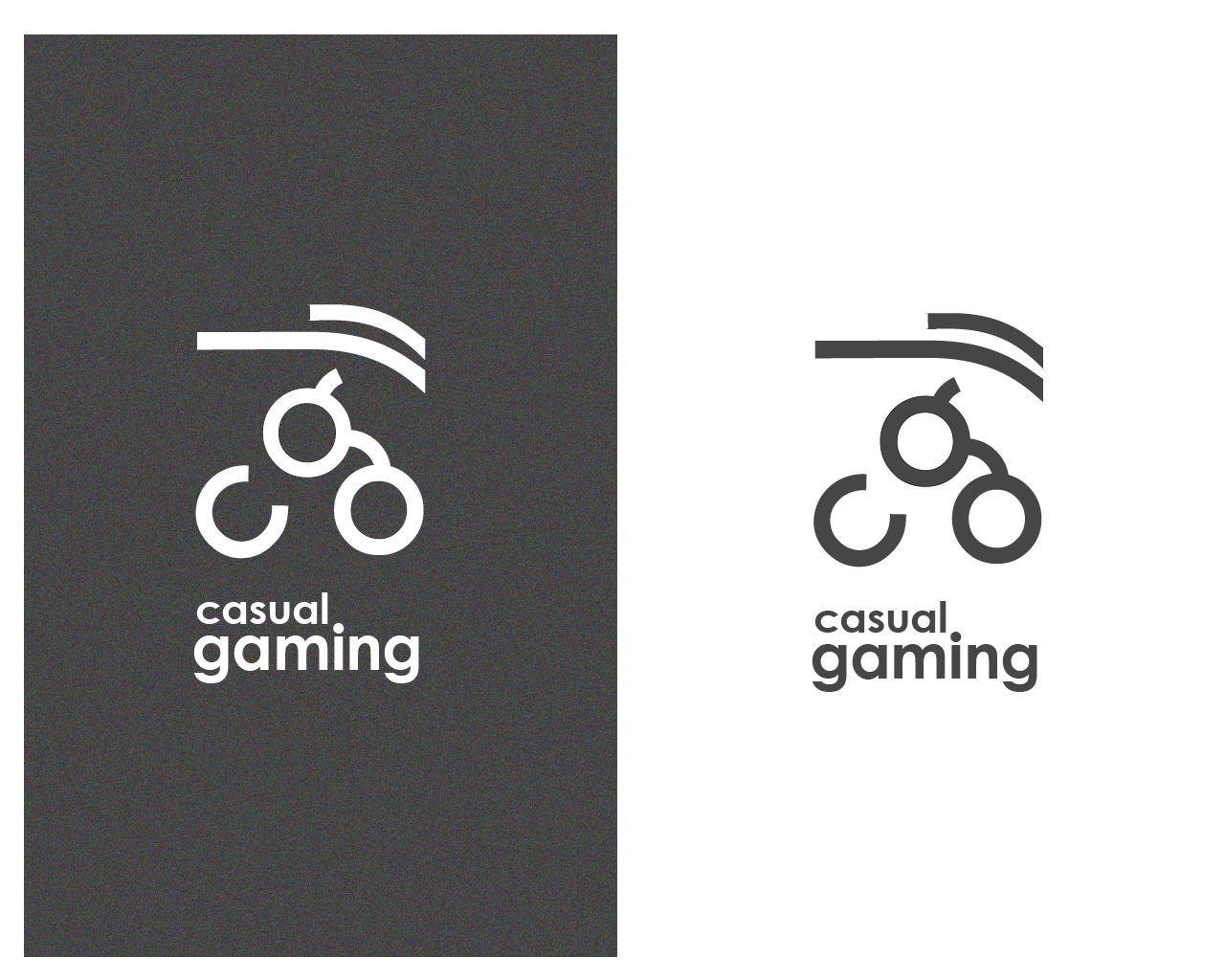
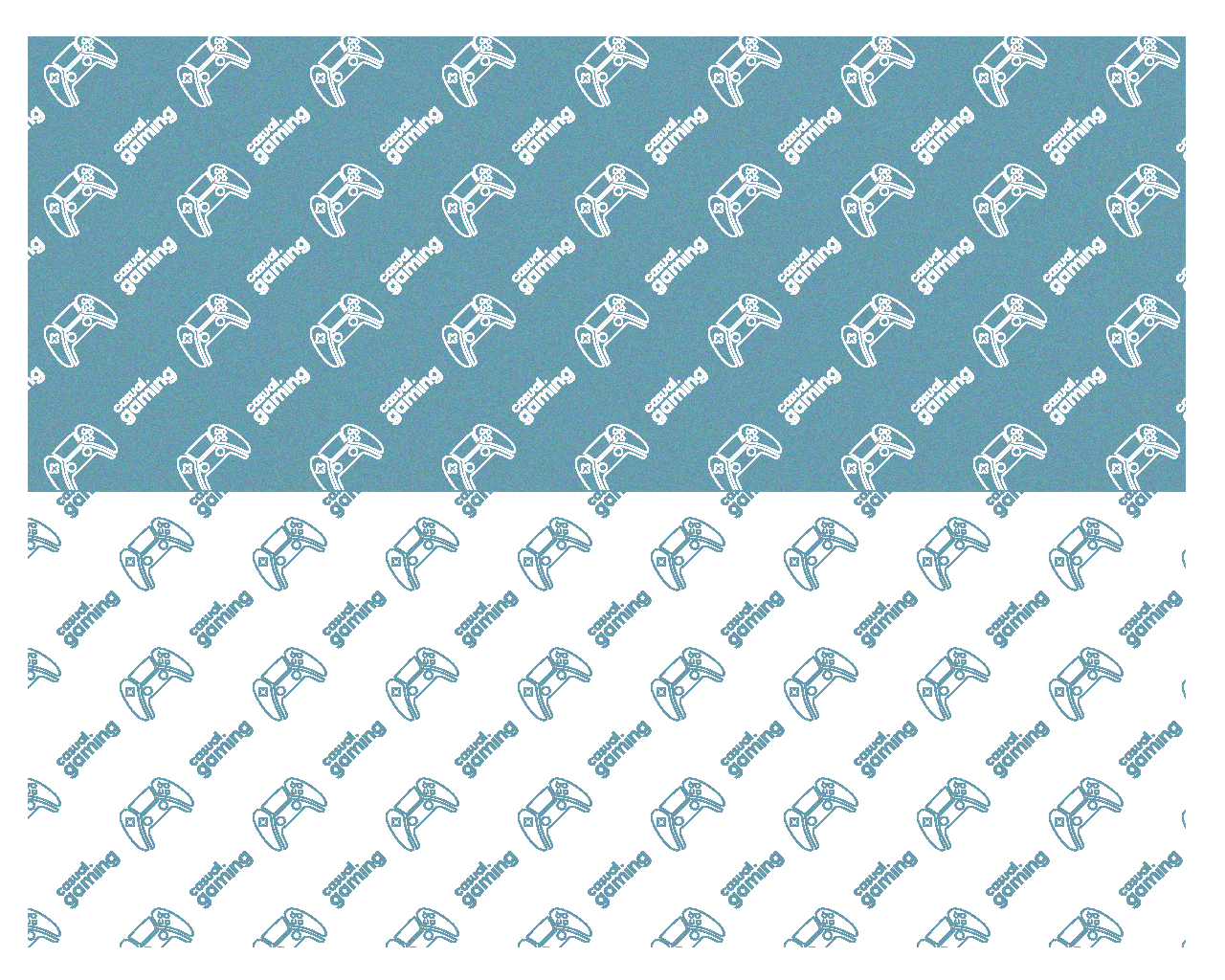
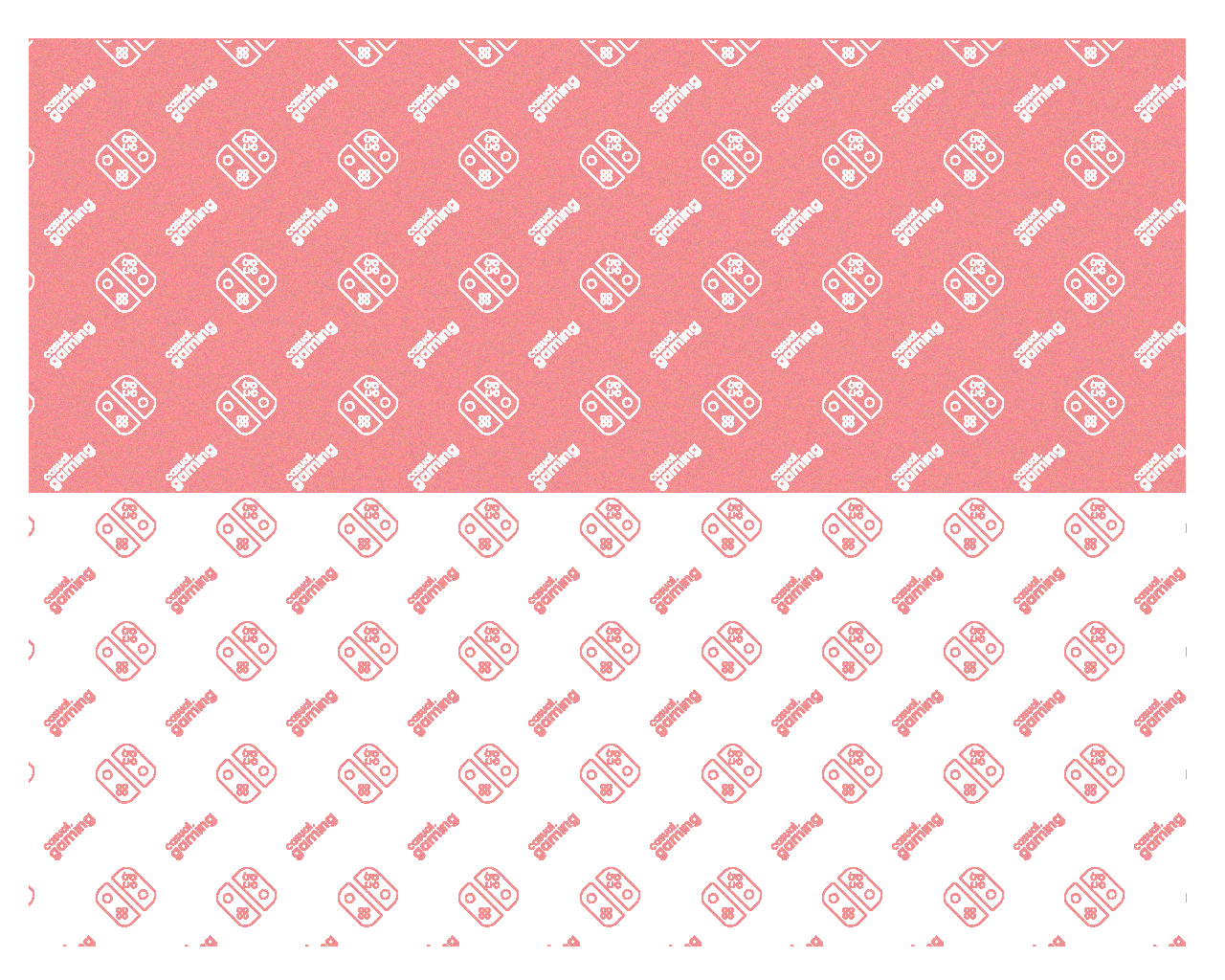
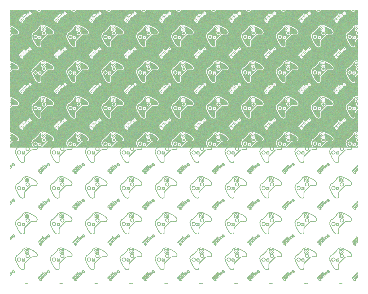
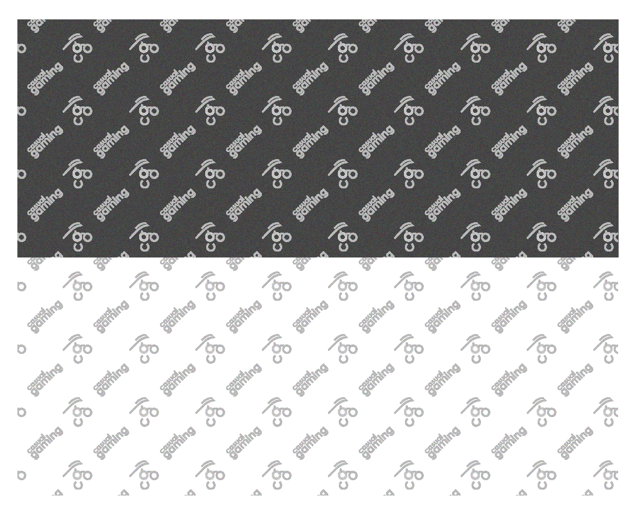
The second option is a play on the iconic button pad. I wanted to pick apart the iconography and play into the nostalgia while being immediately identifiable.
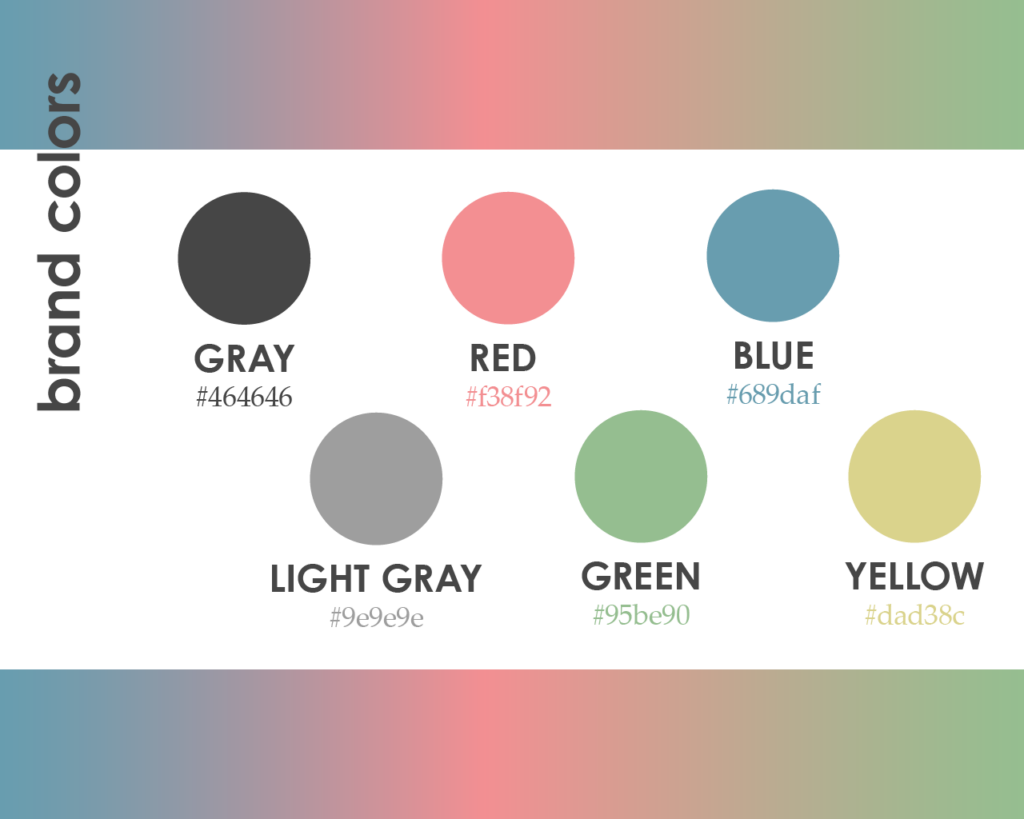
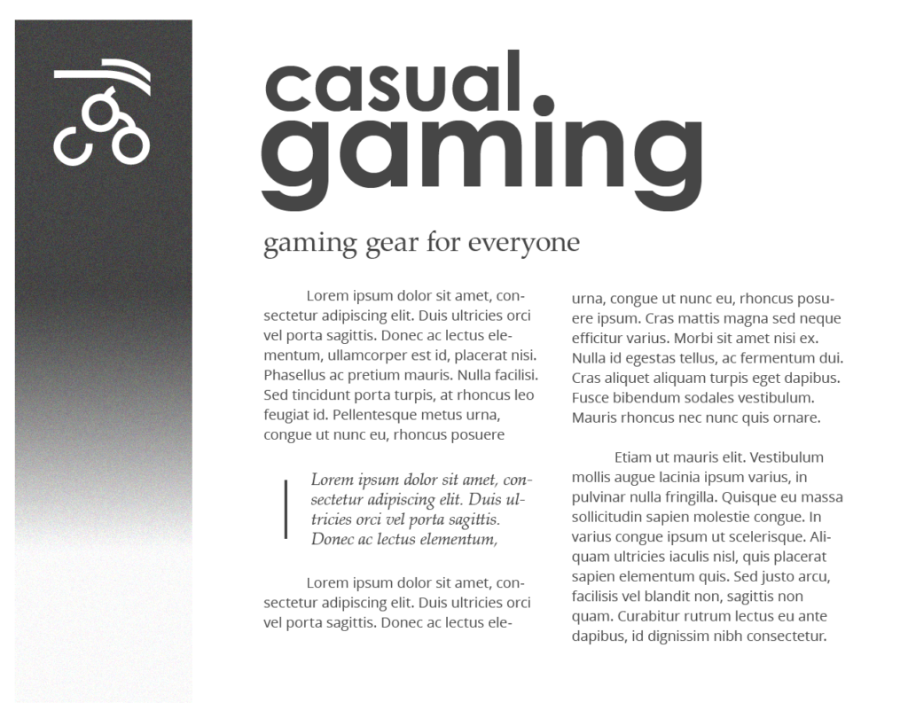
The client immedietely signed off on the button concept and after several round of iteration and finessing, we got our finished logo and brand guidelines
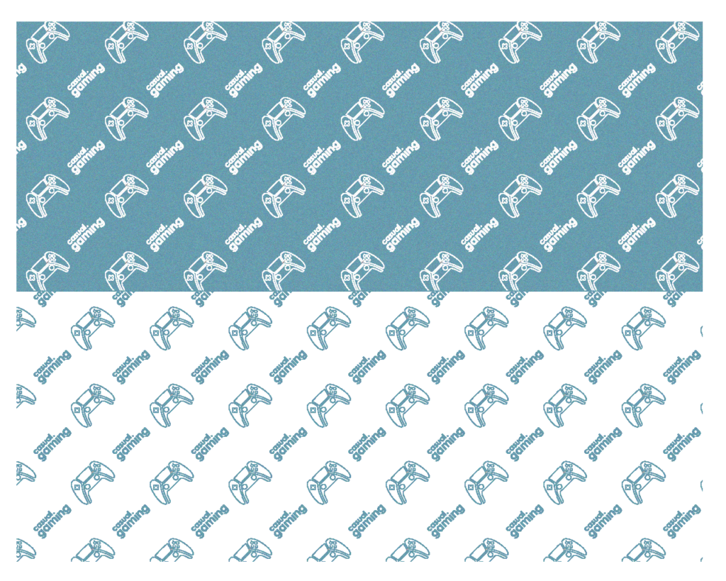
Results