The Challenge
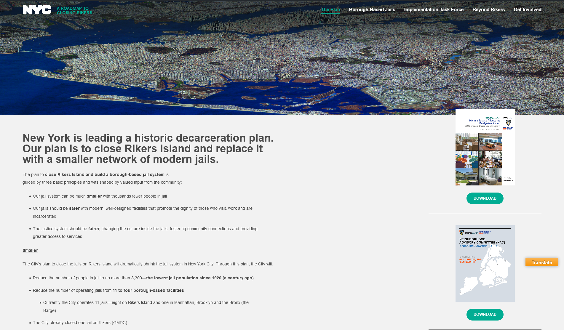
Old website:
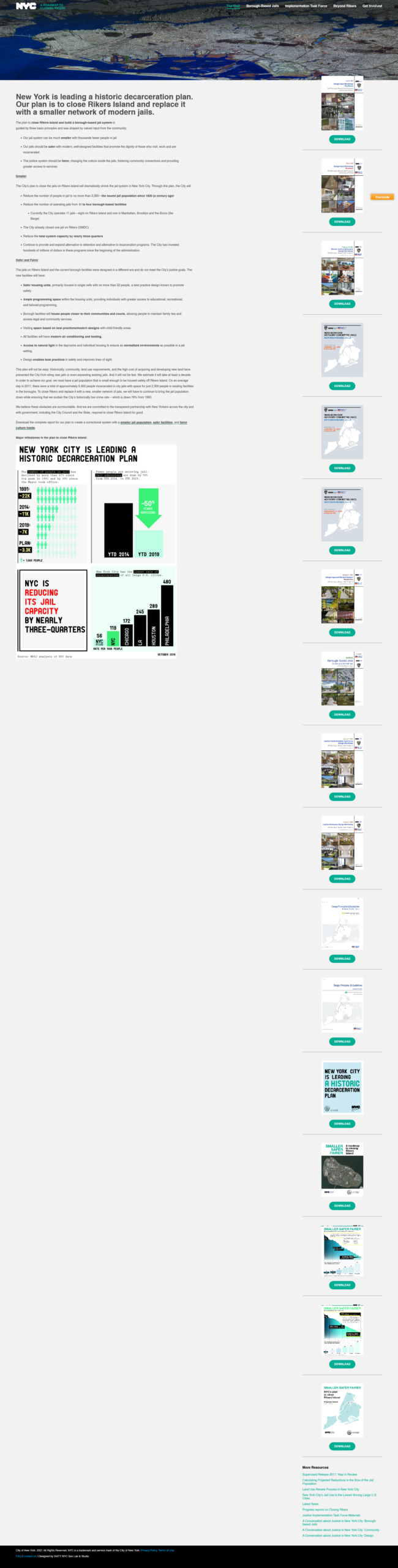
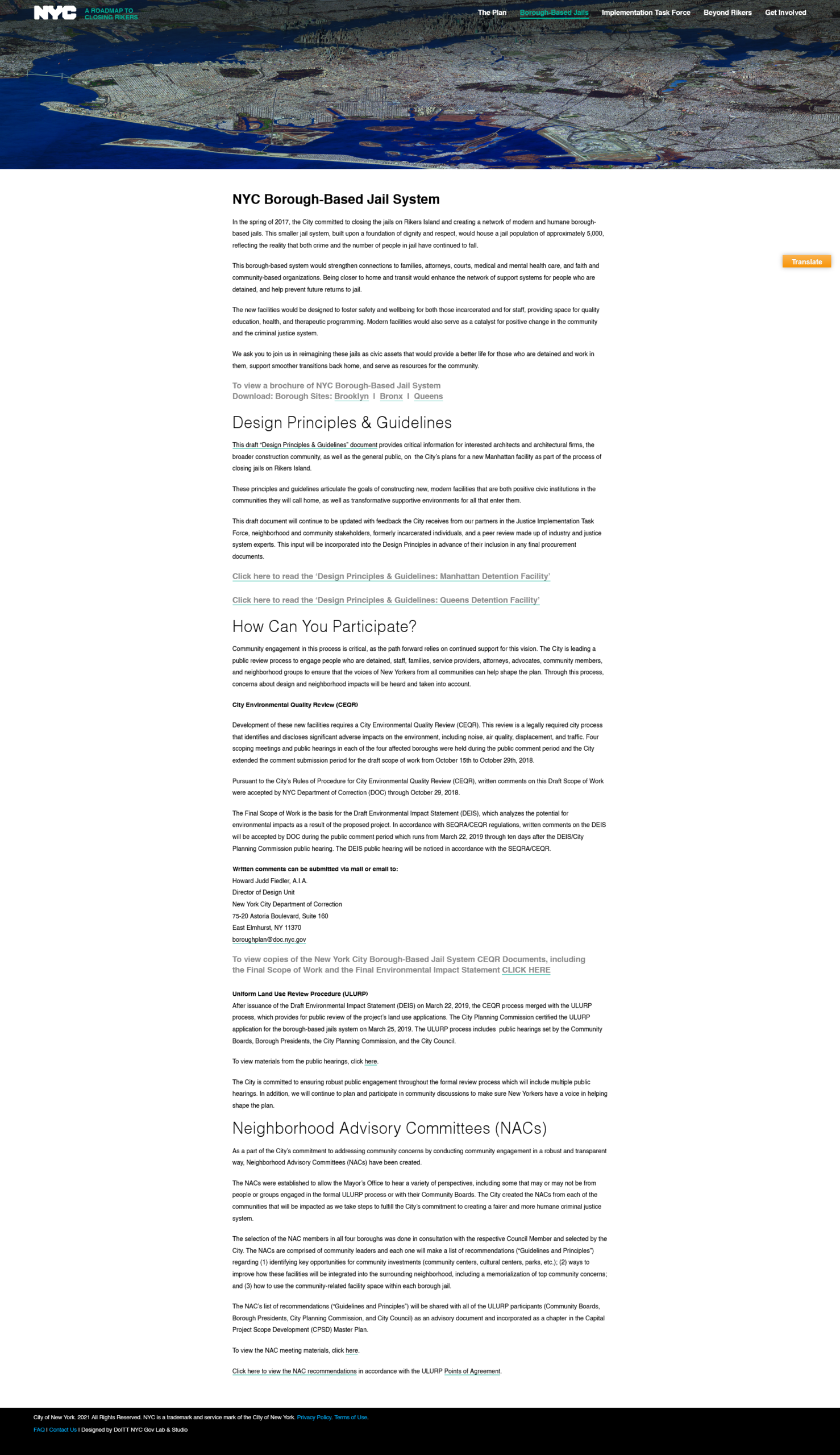
The Closing Rikers project is a historic decarceration plan to close the Rikers Island facility and replace it with a smaller network of safer modern jails. This includes dismantling the current Riker facilities and overhauling current borough facilities.
In 2021, post pandemic and amidst protests for crime and reform, The Mayor’s Office for Criminal Justice, Department of Corrections and the Department of Design and Construction collaborated on redesigning the Closing Rikers website.
I was tasked with the design and development of this part of the project.
After close collaborative meetings with stakeholders, we identified several overall goals for the website:
Project goals:
- Effectively communicate project status and goals while stopping the spread of misinformation.
- Increase the overall search footprint, profile, and traffic of the website
- Provide the means for department and community liaisons to post documents and advisories.
- Organize meetings and provide areas for community, committee, and board meeting minutes and summaries.
- Update and reorganize the old content to better reflect the current status and ongoing initiatives
Key Website Concerns:
- The website suffered from an overly condensed layout that resulted in an overwhelming amount of information and hindered content discoverability.
- The responsive and mobile version of the website was virtually unusable due to bugs
- The documents were either excessively loaded on the homepage or buried deep within their respective committee pages, often requiring significant scrolling to locate the desired document.
- The absence of a search function on the website limited the user’s ability to quickly and efficiently find relevant content.
- The imagery used throughout the website was repetitive and did not align with the intended tone or content of the plan.
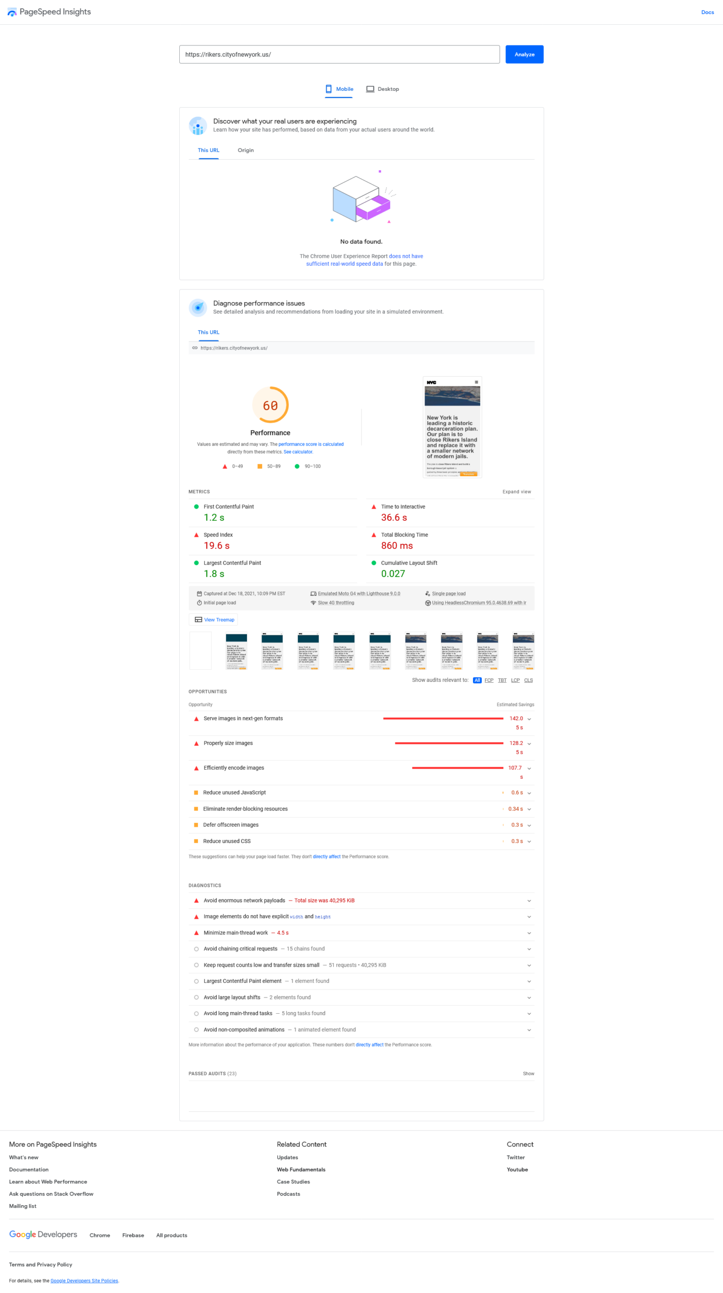
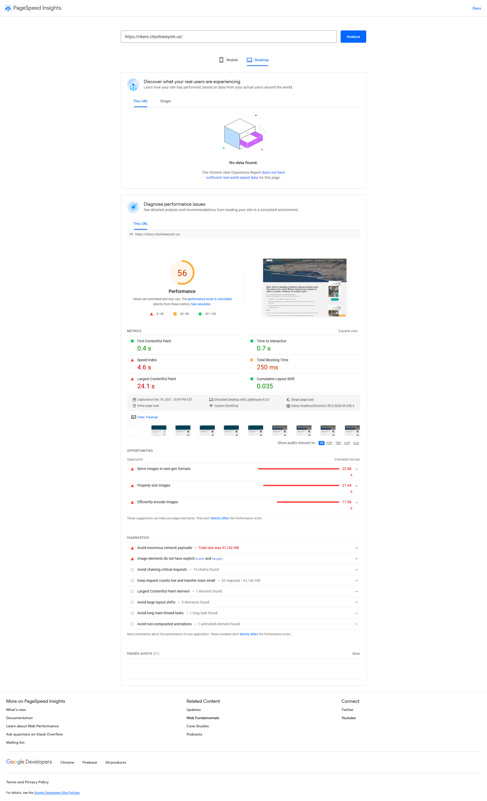
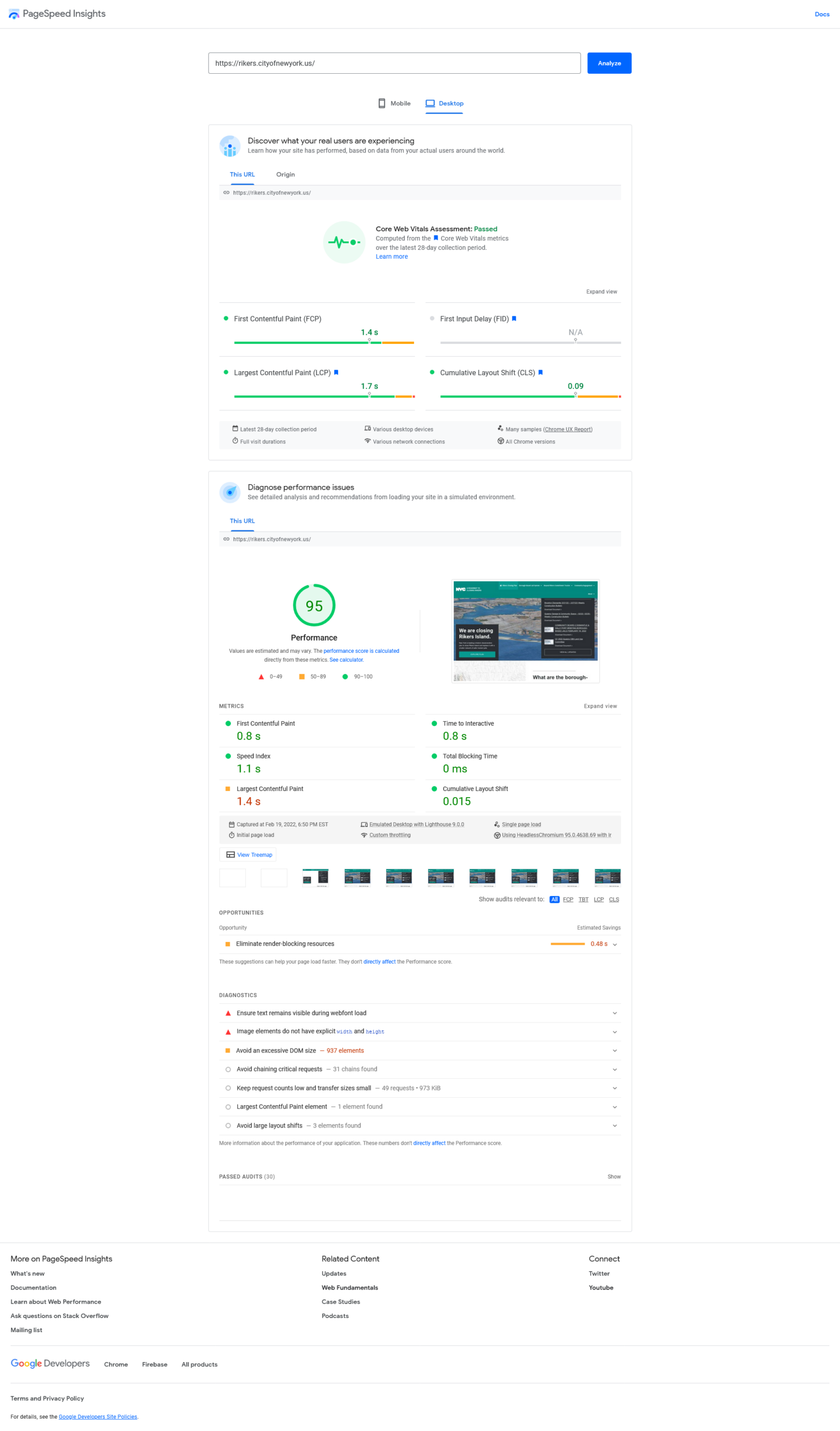
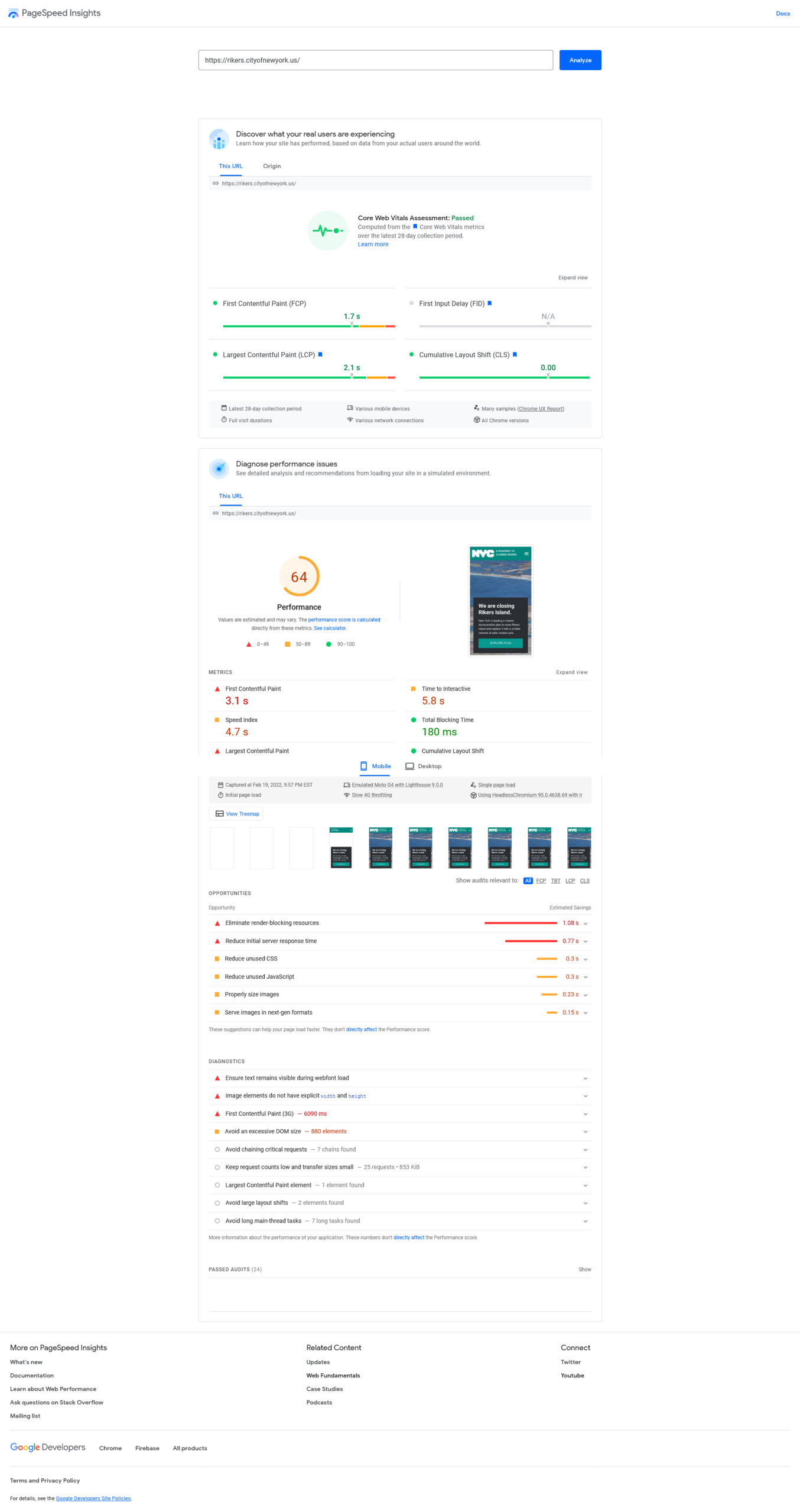
- From a technical standpoint, the website contained render-blocking tracking and translation code and large, unoptimized images (some as large as 100 MB per header). Although the server responses and processing were prompt, the webpage often took a minimum of 5 seconds to load initially and up to 30 seconds to fully render.
The Process
After conducting thorough consultations with the Department of Corrections (DOC), Department of Design and Construction (DDC), Mayor’s Office of Criminal Justice (MOCJ), and Community Liaisons, I commenced the research process. My objective was to gain insight into stakeholder needs and departmental goals, while also seeking to understand the needs and behaviors of both current and potential users of the website.
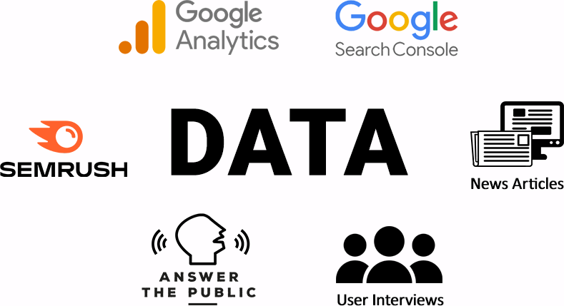
To achieve this, I relied on six primary sources of data for my analysis: Google Analytics, Search Console, SEMRush, AnswerThePublic, news articles, and user interviews. My primary focus was on identifying common user pathways, pain points, and attrition areas.
For current users, I collated data on common user pathways through universal analytics tools such as entrance traffic, user flow, and drop-off points. I also analyzed common search queries from sources such as Search Console, SEMRush, and AnswerThePublic, to identify user intent and language usage related to the project.
To further enhance my understanding of user needs, I collated common questions from public meetings, AnswerThePublic, autocomplete form information, and news articles to identify information that was not readily accessible on the website or information that was creating confusion to the average person.
Based on my research, I crafted three distinct user profiles:
To address any possible issues, I conducted a site audit through pagespeed insights and server logs, followed by a waterfall analysis of the call tree and page rendering.
With a comprehensive understanding of user needs, I chose to optimize for user engagement, retention and search profile. I commenced the redesign process to align with the overall goals of the project and satisfy the needs of all three user profiles.
Solutions
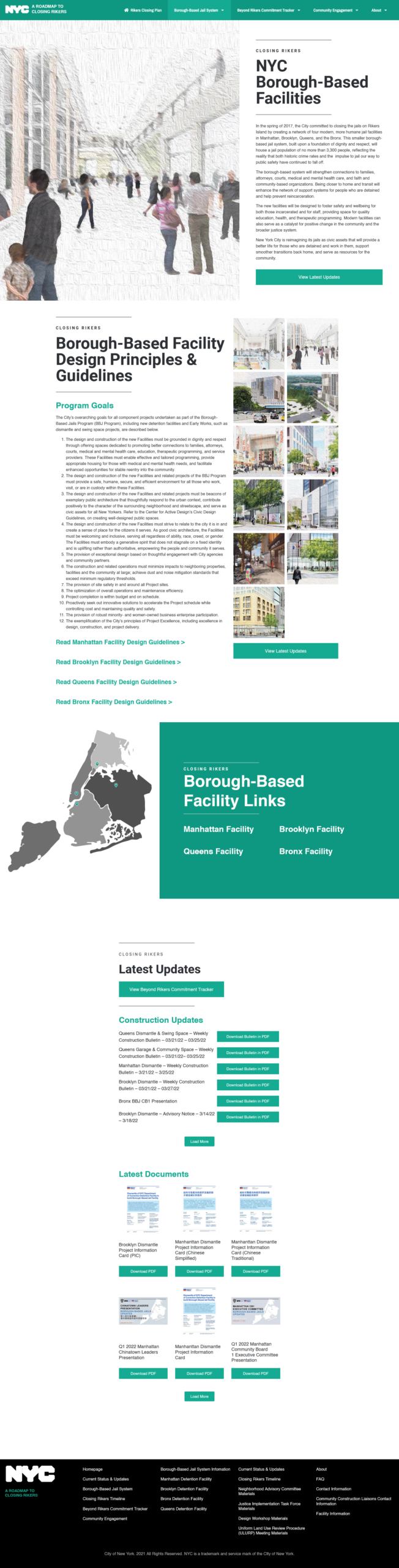
In terms of organization and content, I conducted an assessment of our existing content on both our websites and published documents. I proceeded to create a new sitemap and reorganized the content to improve its navigability and enhance search engine optimization. I also refined the language used in the content to make it more accessible to our audience. I drew from our design documents to flesh out the website’s pages and provided clear and direct answers to common user questions. I allocated designated areas on the website for important documents and meetings, and developed reusable components for these areas where possible.
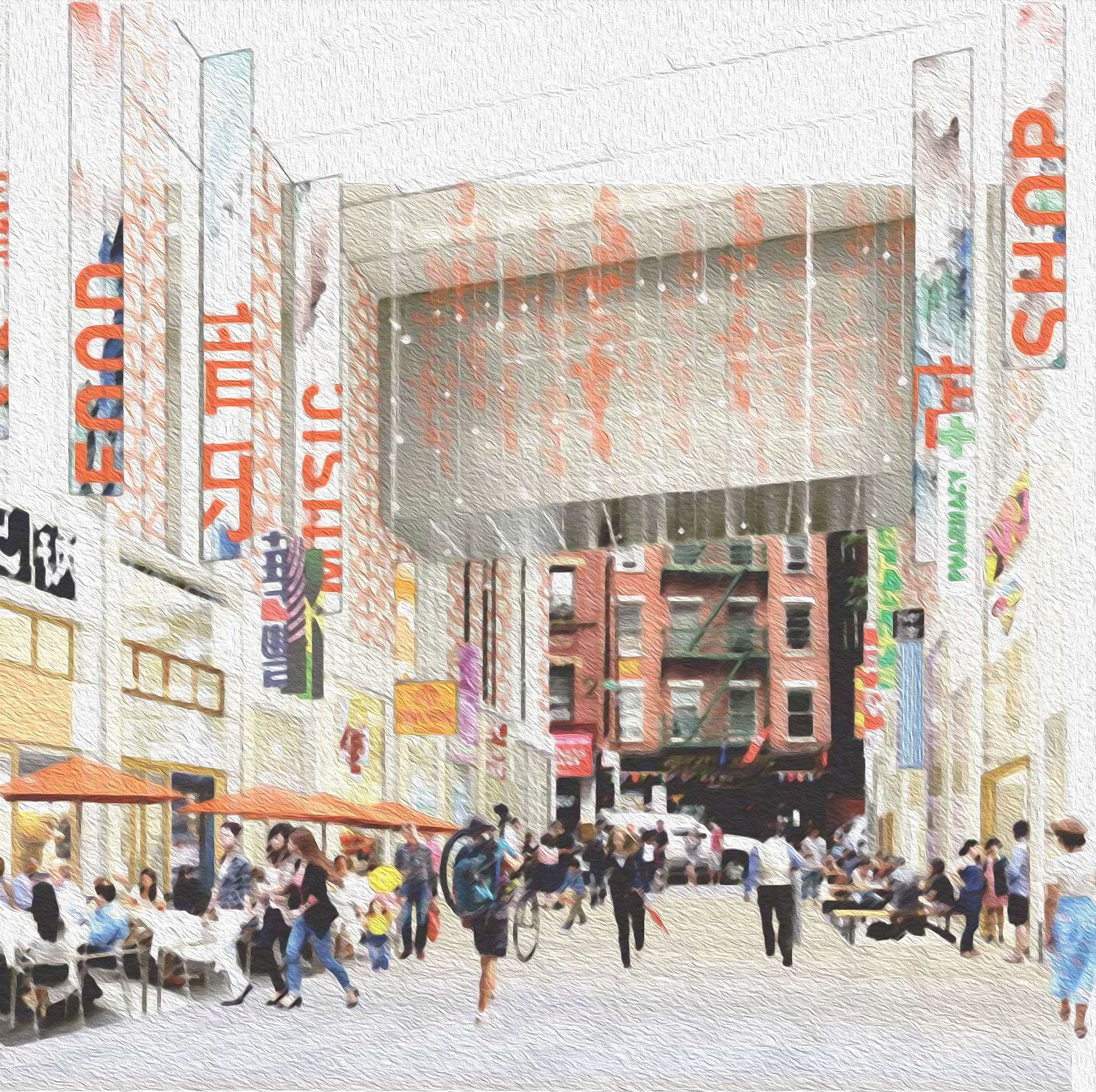
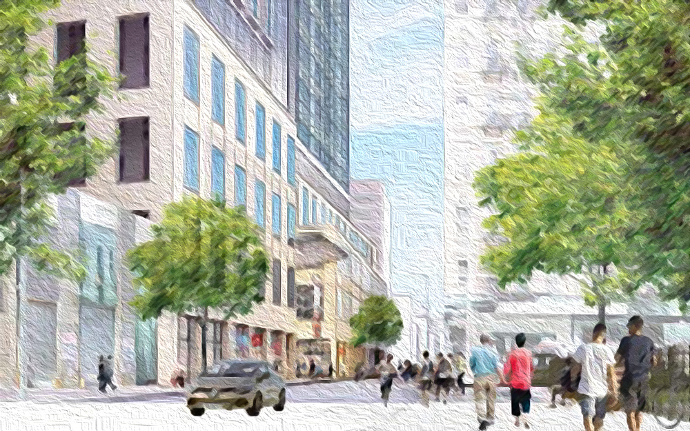
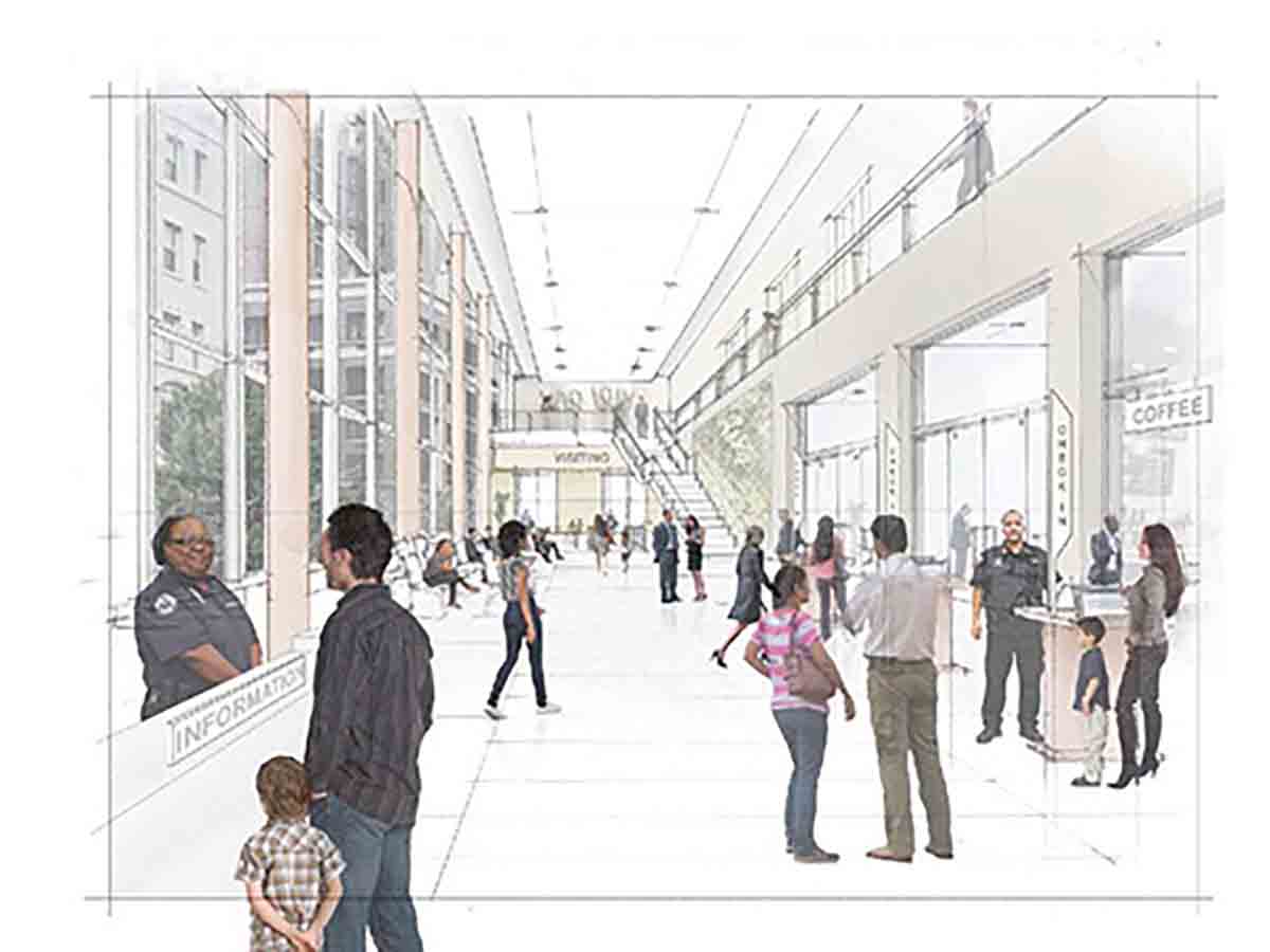
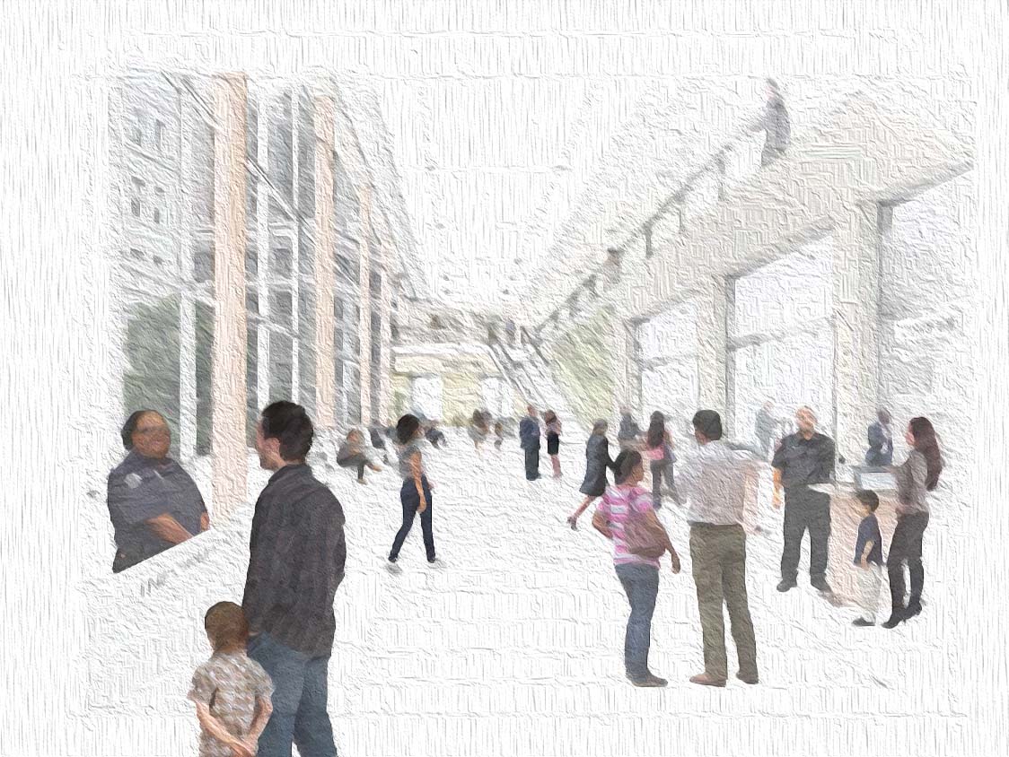
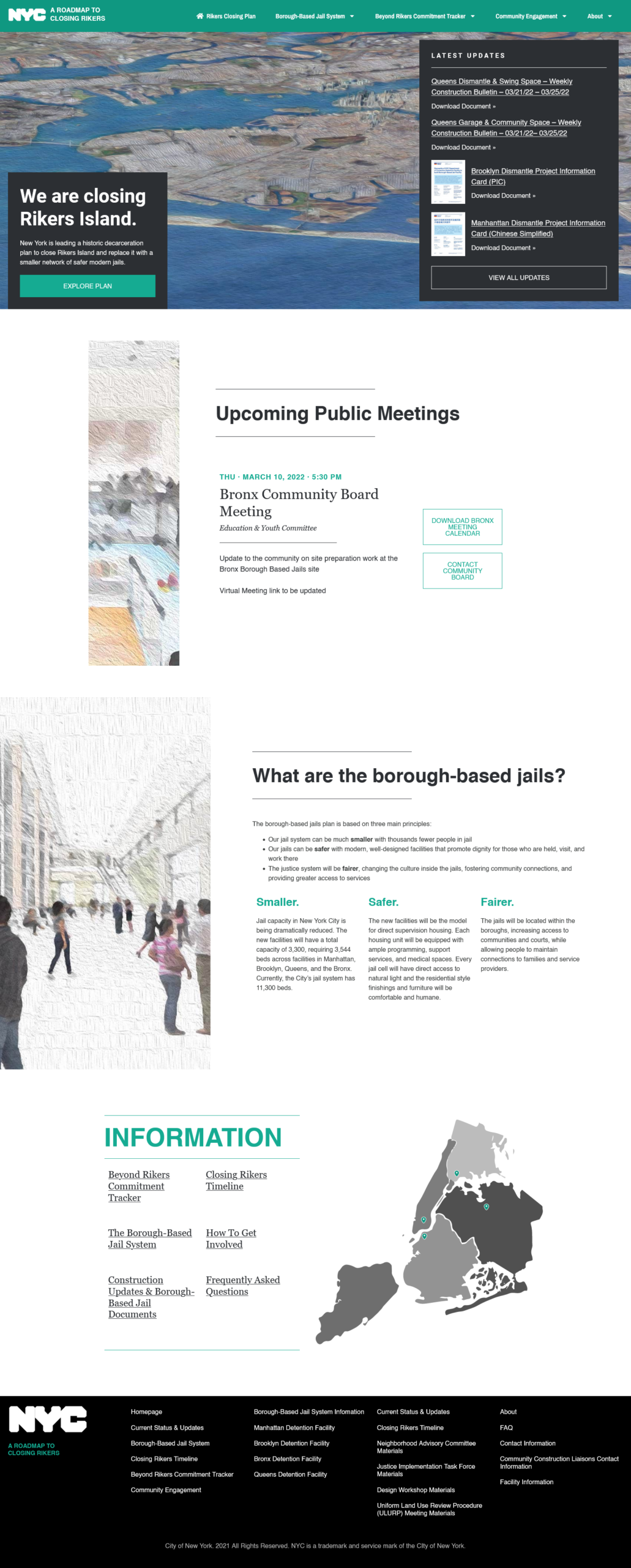
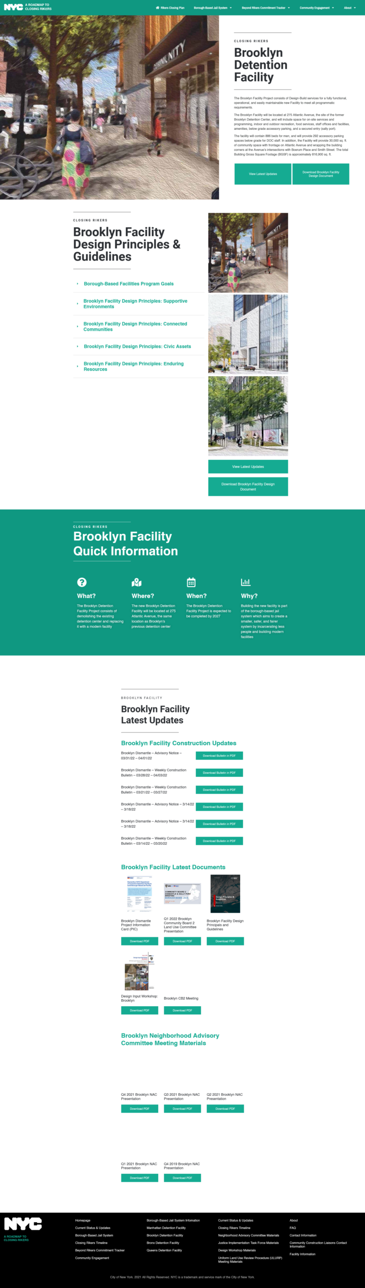
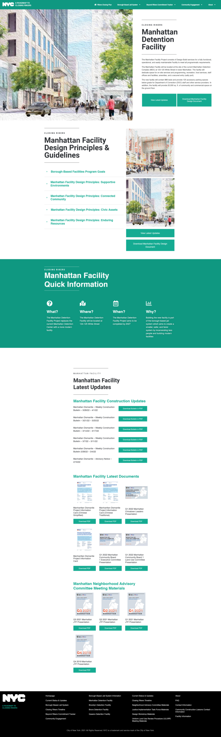
With deep collaboration with Christiana Zafiriadis and Colby Hamilton, I created mockups using Figma and Photoshop of websites that would match the tone of the community spaces that the new facilities would have as well as the friendlier tone. A big issue with this project is the lack of images due to this being a future project. We did not want to present these as already built projects
The concept images from the publicly approved documents were too low resolution to be used on the website and contained stock images of people. On top of that, the design and architect firms that created the documents would have added another layer of complexity and budget on top of government approval processes. I needed to utilize already approved images given the short timeline but also evoke the sense of warmth and community that we wanted the project to have
I solved this issue by using an AI and feeding it upscaled versions of our pictures. From there, I wanted to evoke the sense of warmth, hope and community so I mimicked impressionist paintings for the dreamlike and warm tone. I was able to create high resolution pictures and avoid the majority of the re-approval process this way
On the technical side, I developed a custom theme for the website and optimized the delivery of all assets. To enhance website performance, I async loaded most files and incorporated auto image optimization into the website’s workflow, which was dependent on custom post types. I also created different roles for community liaisons to make changes on the website and upload their documents. Since the project needed to be flexible, I also included a page builder in the website’s development process.
Results
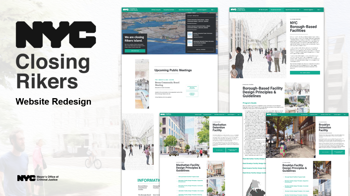
The entire process took five months, culminating in the launch of the new website in February 2022. With the successful launch, we improved on all of our key metrics when compared to the average government websites and our past results from the previous year
Average Search Result Position
We also vastly improved our technical rollout despite having 4x or 5x the amount of content and information
Showcase


