The Challenge
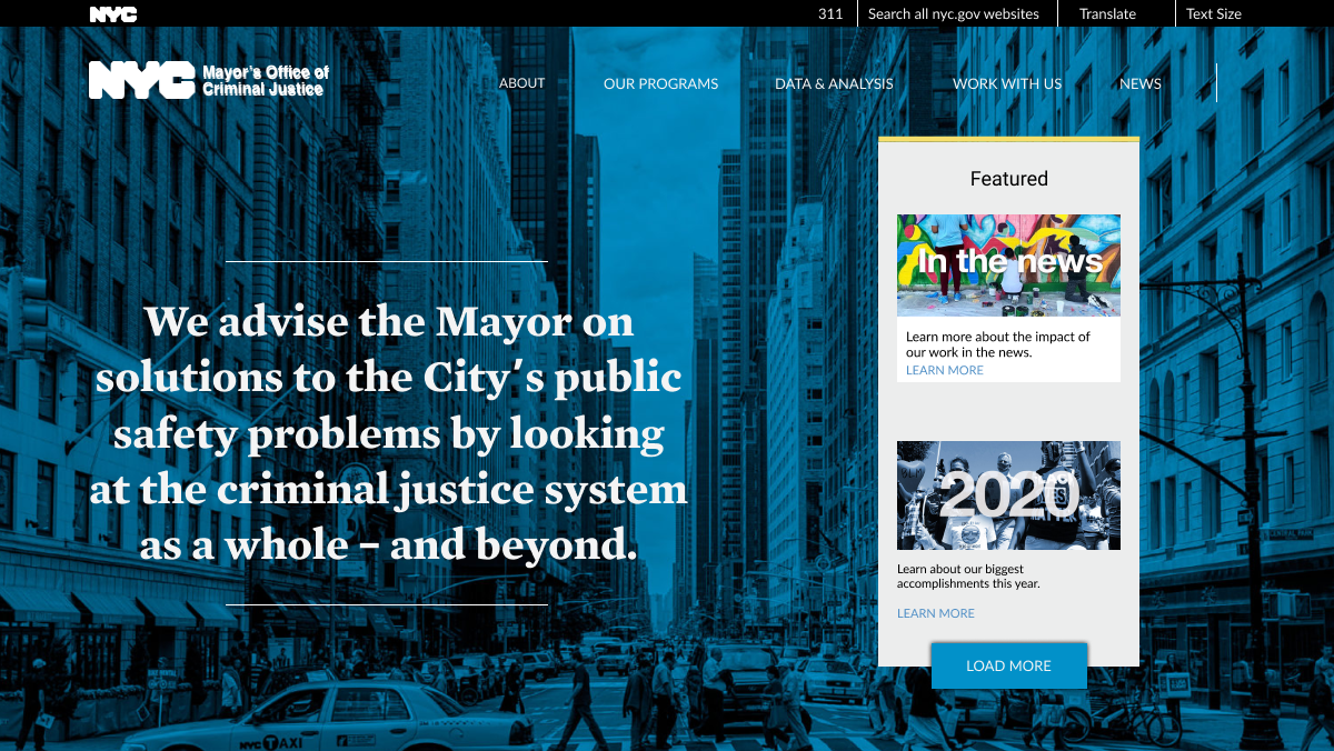
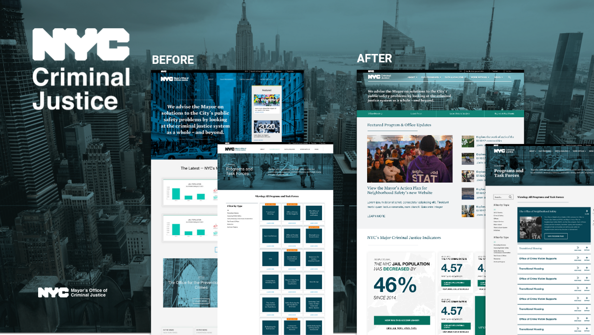
Old website:
The original website served the department well. It was originally meant to establish the mission statement and the context of the department in the overall vision for criminal justice.
However, after growth and establishment, the homepage was no longer servicing their needs
Key Website Concerns:
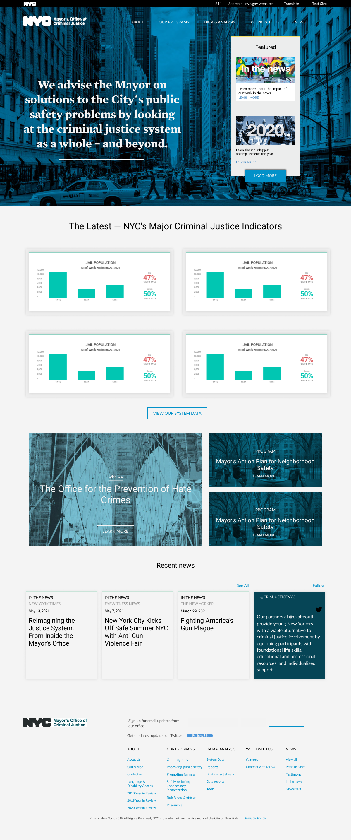
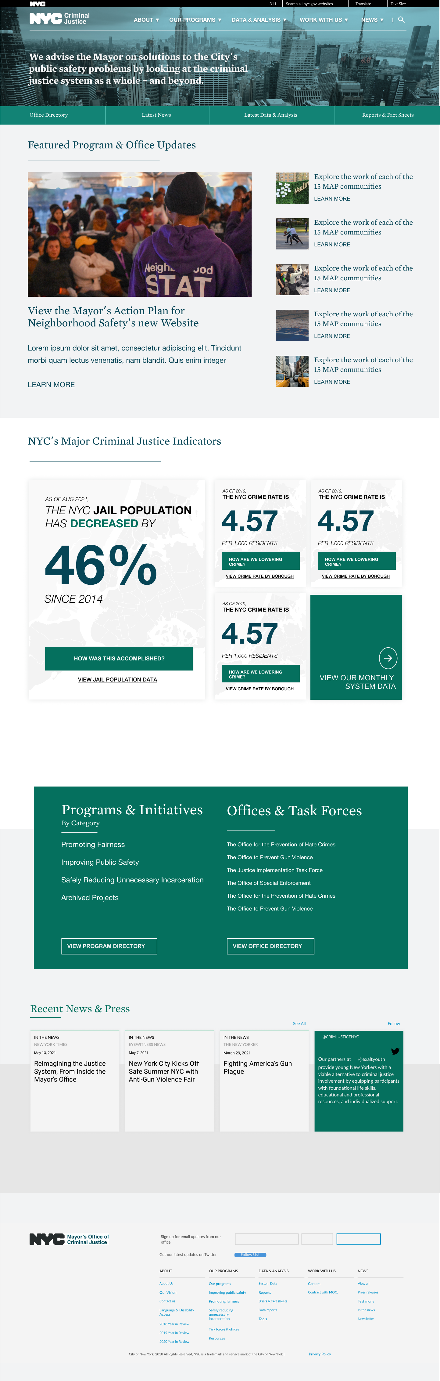
- The largest issue is that the website didn’t communicate how active the office was despite the amount of work. The majority of the first contentful paint was a mission statement and actual news was hidden behind several clicks
- The statistics on the homepage were outdated and unclear on our impact. This also was pulling data from a 3rd party graph animation widget which caused slowdown
- The navigation didn’t reflect the most common visited pages of users
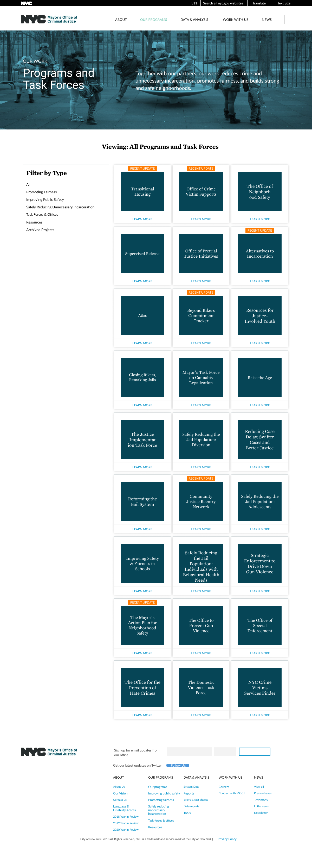
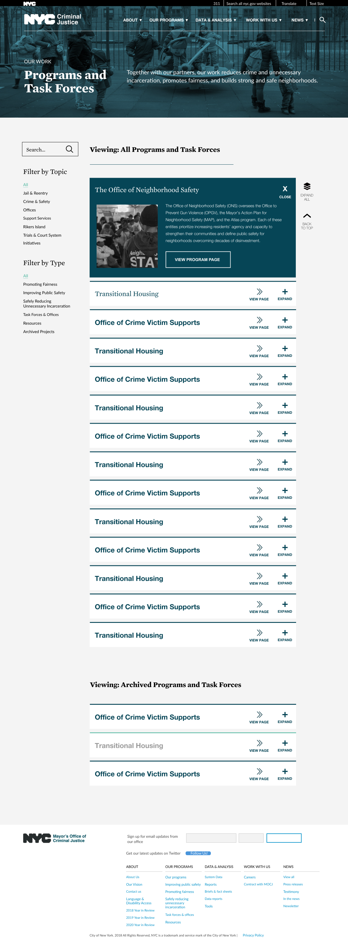
- The program page wasn’t suited well for scanning. It also heavily depended on the average user knowing what each department did beforehand
- The imagery used throughout the website was repetitive and did not align with the intended tone or content of the plan.
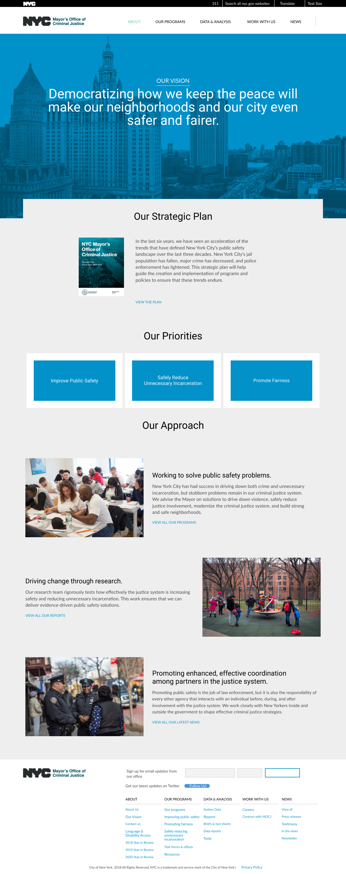
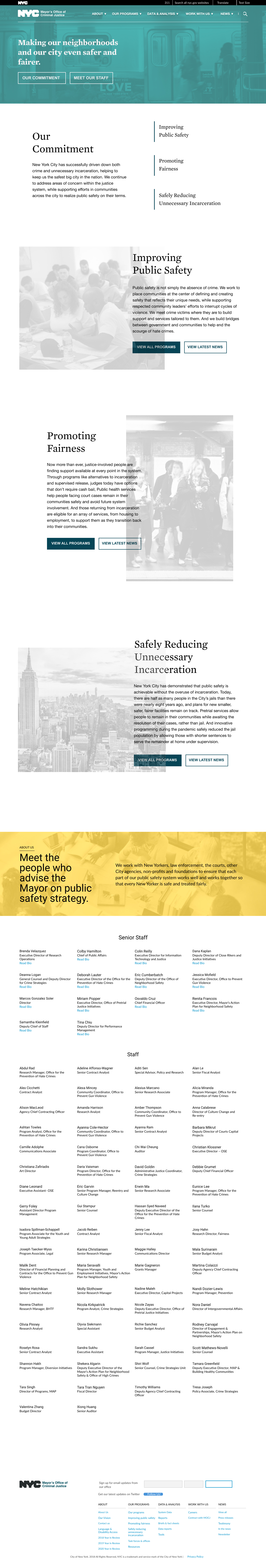
- The about us page needed a refresh as we were transitioning to new leadership and it needed to be modular as the mission statement was in flux
The Process
After conducting thorough consultations and meetings with department heads and regular maintainers of the website, I commenced the research process to understand user usage patterns. My objective was to align stakeholder needs with the needs and behaviors of both current and potential users of the website.
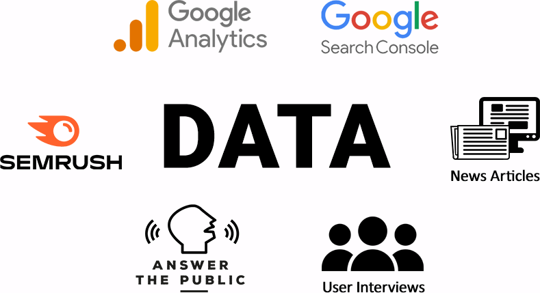
To achieve this, I relied on six primary sources of data for my analysis: Google Analytics, Search Console, SEMRush, AnswerThePublic, news articles, and user interviews. My primary focus was on identifying common user pathways, pain points, and attrition areas.
For current users, I collated data on common user pathways through universal analytics tools such as entrance traffic, user flow, and drop-off points. I also analyzed common search queries from sources such as Search Console, SEMRush, and AnswerThePublic, to identify user intent and language usage related to the project.
To further enhance my understanding of user needs, I collated common questions from public meetings, AnswerThePublic, autocomplete form information, and news articles to identify information that was not readily accessible on the website or information that was creating confusion to the average person.
Based on my research, I crafted three distinct user profiles:
For technical issues, I did an assessment through pagespeed insights and waterfall rendering. The website was fairly robust already with just image servicing issues and the aforementioned 3rd party graph tool
With a comprehensive understanding of user needs, I chose to optimize for user engagement, retention and search profile. I commenced the redesign process to align with the overall goals of the project and satisfy the needs of all three user profiles.
Solutions
With deep collaboration with Christiana Zafiriadis and Colby Hamilton, I created mockups using Figma and Photoshop of websites that would match the tone of the existing webpages. I focused my efforts on the most commonly visited pages, the homepage, programs page and about us page.
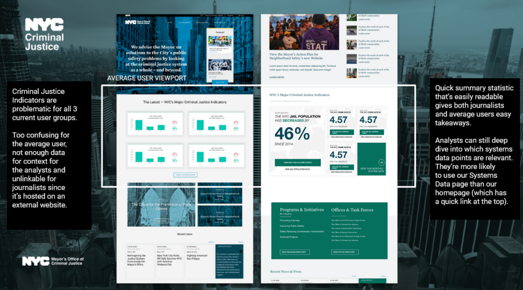
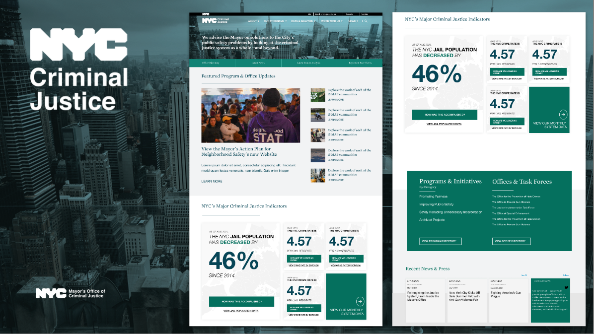
For the homepage, I created a more compact and news focused above the fold section. For the navigation, I optimized for common user pathways or desire paths.
For the statistics section, I completely took it away and replacd it. These indicators were doing a poor job of communicating our office’s impact while having technical burden and also not servicing our core user groups.
I replaced it with graphical summary sections that highlighted key takeaways from data to make it more easily scannable and link directly to data sources or the programs that are impacting these figures. Using these modular sections also allowed us to explain the nuance behind the numbers or explain the current situation in a context neutral way
Results
The entire process took five months, culminating in the launch of the new website in October 2022.
Showcase


