Home
Projects
About
Contact Me
Home
»
Graphic Design
»
Page 2
Tag: Graphic Design
Fun Stuff • Merchandise & Apparel Design • Web Design & Development
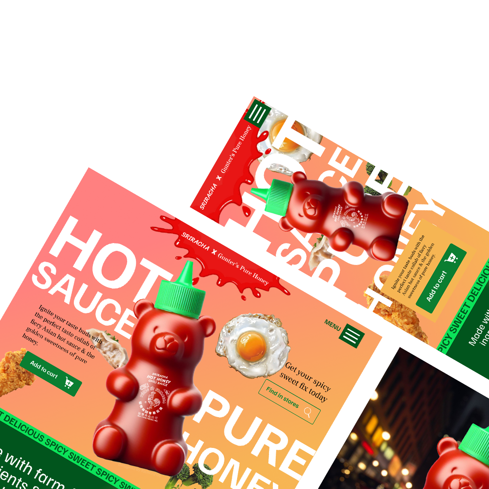
Honey Sriracha Sauce Website Concept
Featured • Web Design & Development
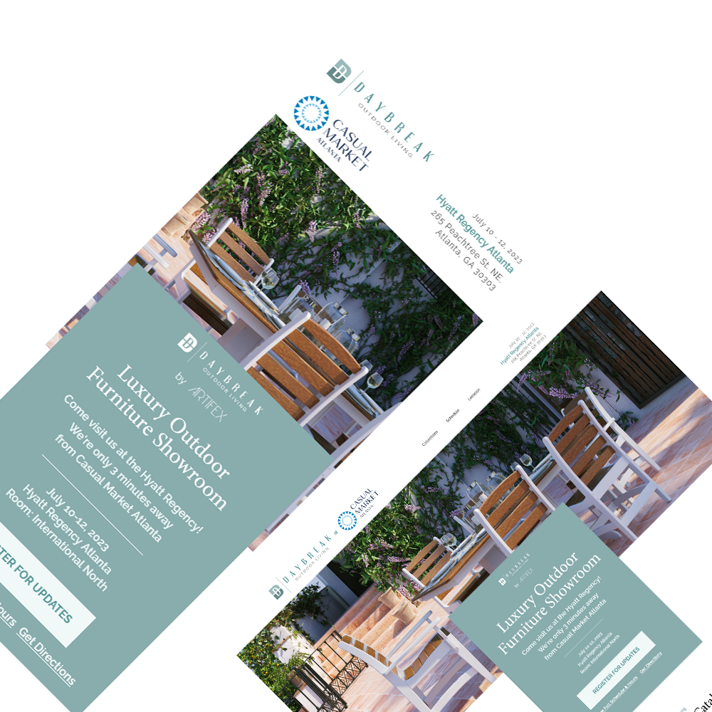
Daybreak Outdoor Living
Featured • Web Design & Development
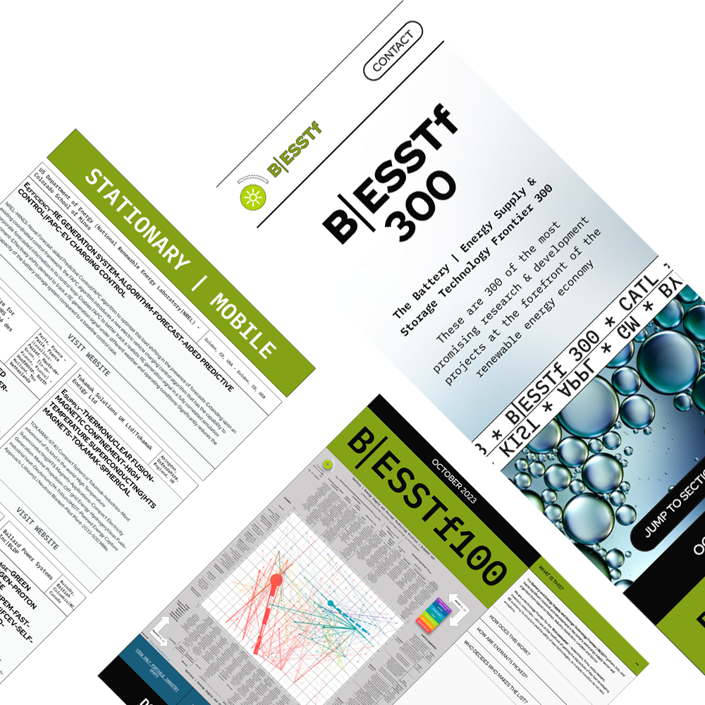
Battery, Energy Storage and Supply Frontier
Branding & Logo Design • Featured • Illustration & Graphic Design • Merchandise & Apparel Design
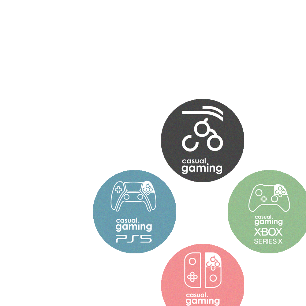
Casual Gaming
Featured • Web Design & Development
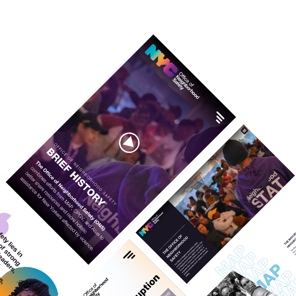
NYC Office of Neighborhood Safety
Featured • Web Design & Development
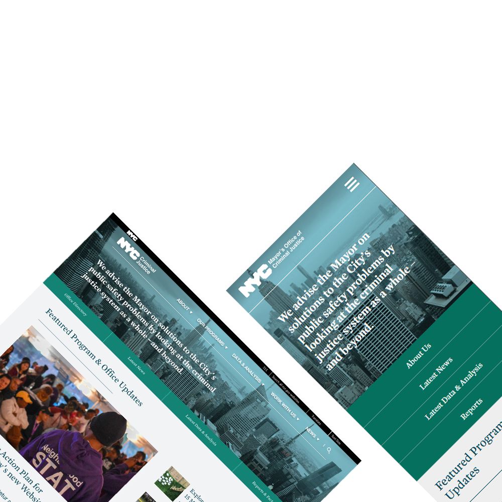
NYC Criminal Justice