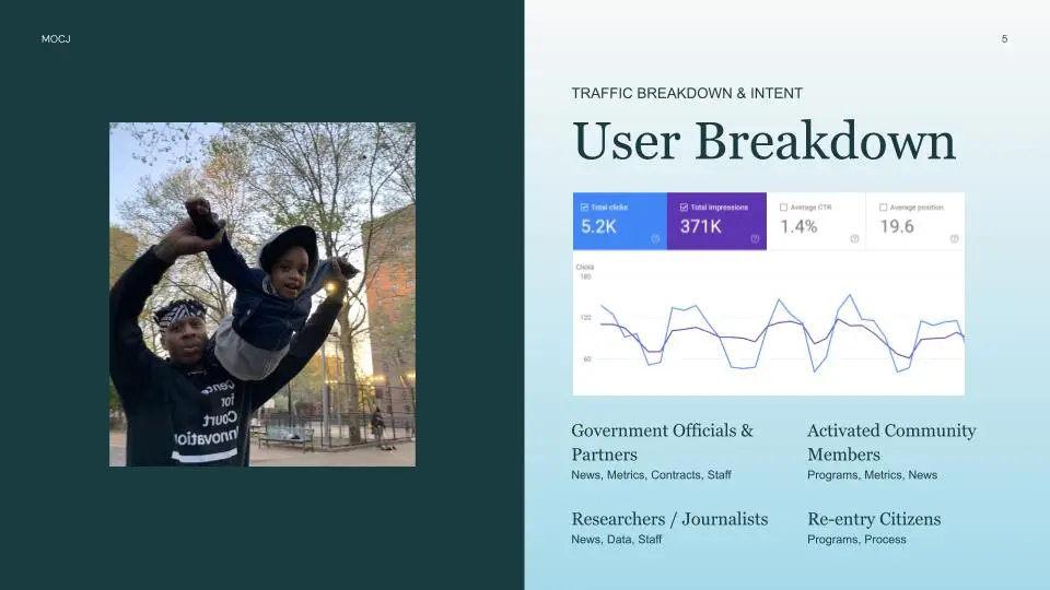
Discovery across five internal teams. Before any design or development work began, I ran a discovery process with each of the office’s five internal teams: Policy, Diversion & Transition, Community Innovations, Research & Data, and Housing. Each team had distinct content needs, audience priorities, and ideas about how their area should be represented on the site. To move the conversations from preference to evidence, I brought search and website data into each one. What were civilians actually searching for in each team’s area? Which existing pages were performing, which weren’t, and why? Where was the office’s internal language diverging from public search intent? Grounding the discussions in data turned a set of separate wish lists into a coordinated plan for the platform as a whole.
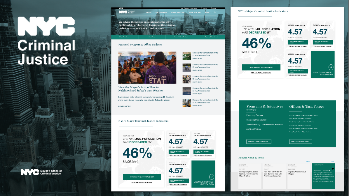
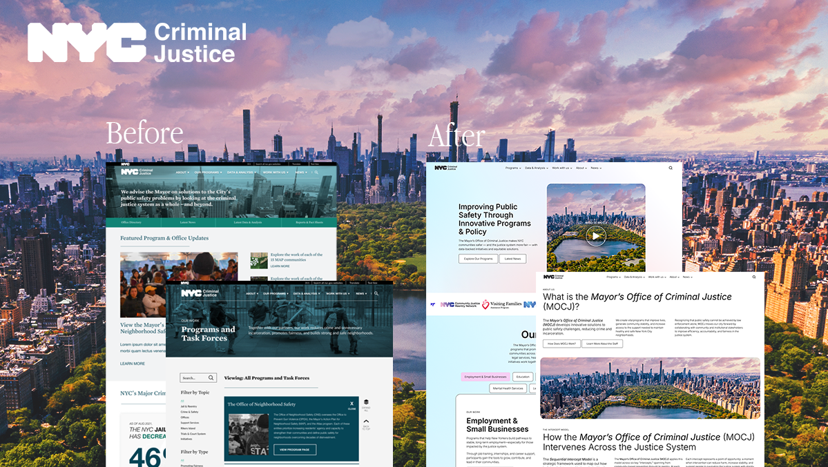
Translating organizational direction into site structure. Once the community-focused framing and the intercept-model program approach were established through the discovery process, my job was to express those directions in the IA and the visual system. That meant deciding what got surfaced, how programs were grouped, what the front door of the site emphasized, and where things lived.
Merging three vocabularies into one site. The terminology used across the site (section names, page titles, program descriptors) was a call I made by reconciling all three audiences against the data. I pulled incoming search queries to see how civilians were actually looking for MOCJ, cross-referenced the language analysts and researchers used in adjacent policy contexts, and mapped both against the office’s internal naming. Where the three diverged, I made deliberate choices about which vocabulary led, which were preserved as alternates for search and accessibility, and which got reframed entirely. That reconciliation is part of why the search position numbers moved as much as they did.
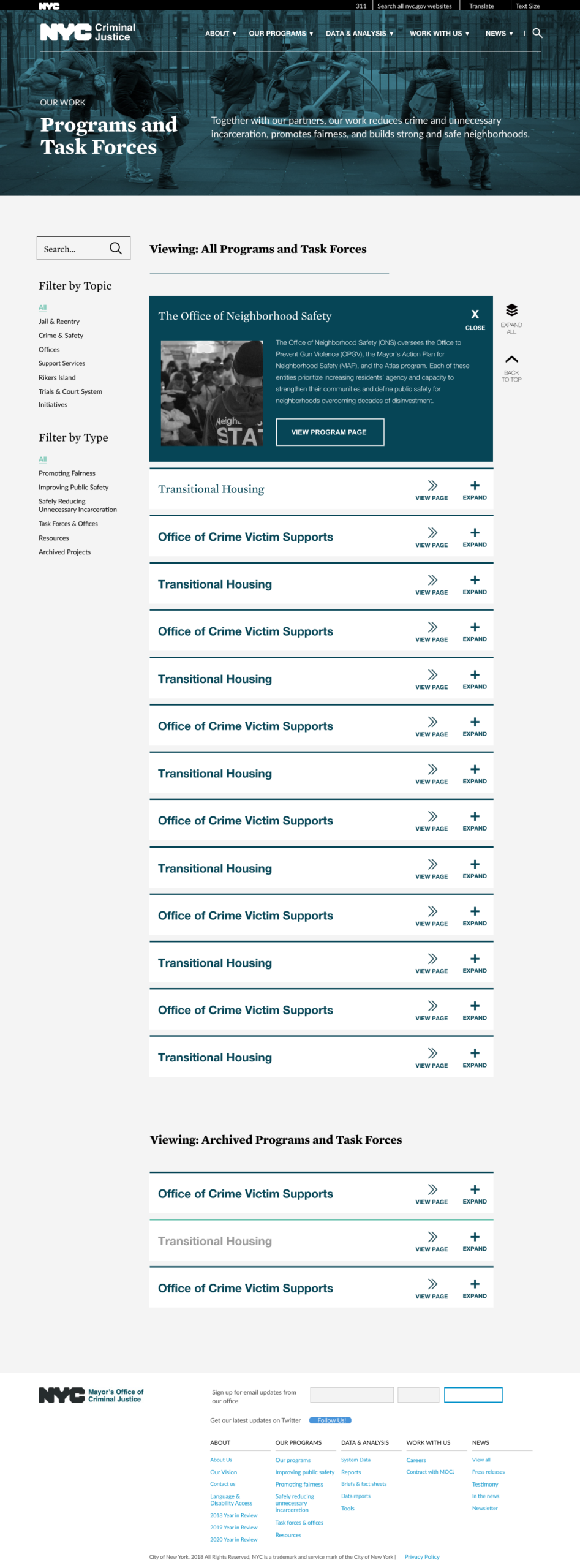
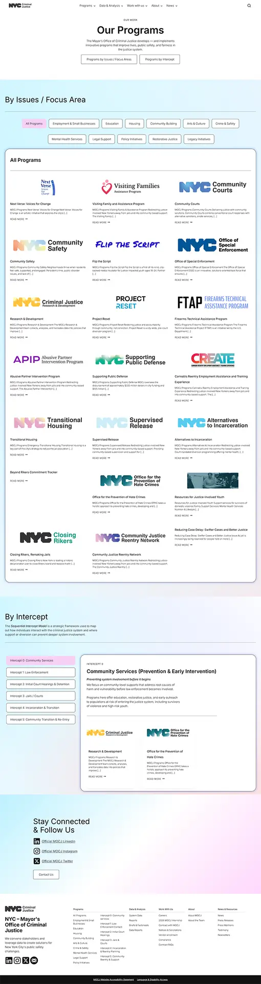
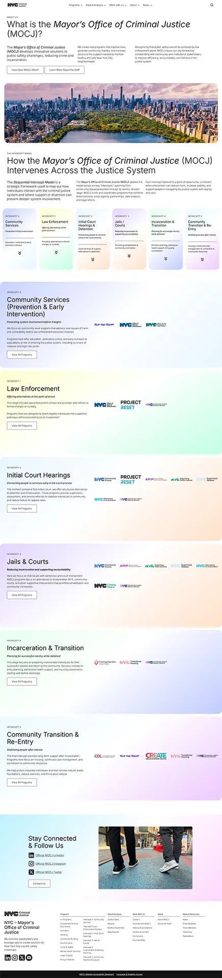
Surfacing the intercept model. One specific case of the vocabulary work: in conversations with Diversion & Transition, I learned the team was framing their programs along the intercept model, which maps where the criminal justice system can intervene at each stage of a case’s progression. Civilians weren’t searching for “intercept.” They searched by domain (education, housing, employment, reentry). But for analysts and policy makers, the intercept model was the most useful frame for understanding how MOCJ’s work fit together. I built it into the About page as a way to explain the office’s overall approach, and added intercept tagging to individual program pages. Programs could now be browsed by domain or by where they sat in the intercept model. The same content, surfaced two ways depending on how a visitor arrived.
IA built around the office, not the moment. Sections were structured around enduring functions like programs, community resources, and who we are, rather than around current initiatives. Specific programs can slot in and out without restructuring the site, which is what makes it durable across administrations.
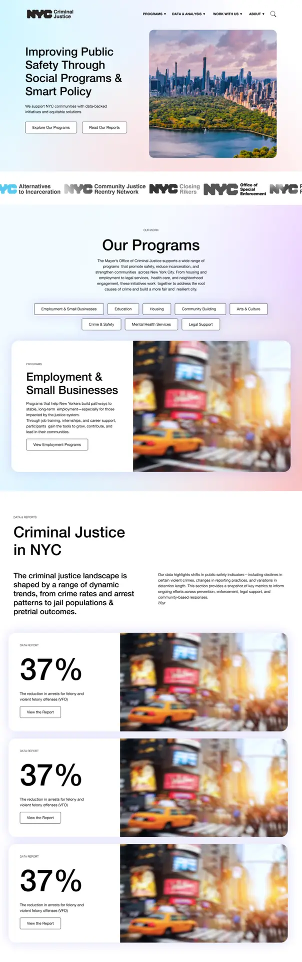
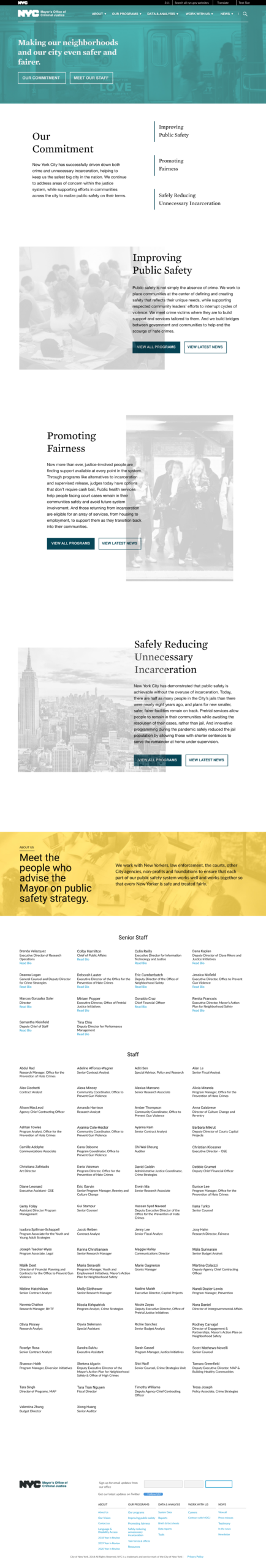
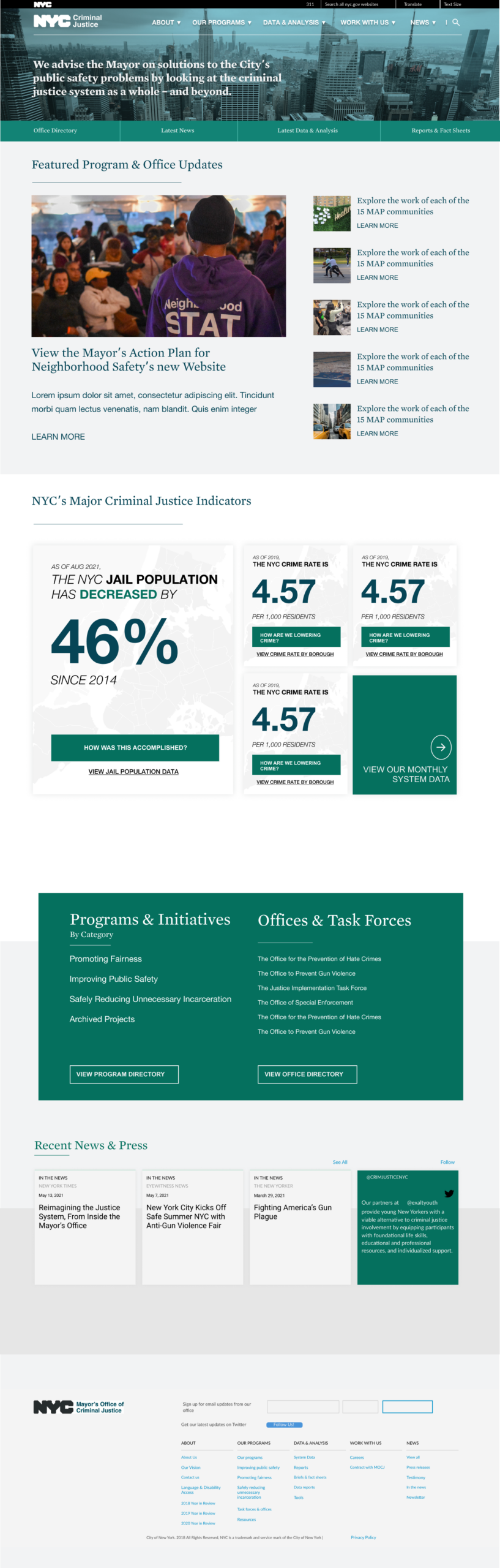
Grounding the community-forward direction in data. The office had been steered toward a community-forward identity, and the site needed to reflect that. But community-forward work is strongest when it’s grounded in evidence, both for transparency to the public and for credibility with the analyst and policy-maker audiences the site also served. So I architected prominent space for research and data alongside the community-focused framing, treating the two as complementary rather than competing. Building that space into the IA now also future-proofs the site: as the office’s priorities evolve over time, the structural space for data and research remains available without needing to be rebuilt back in.
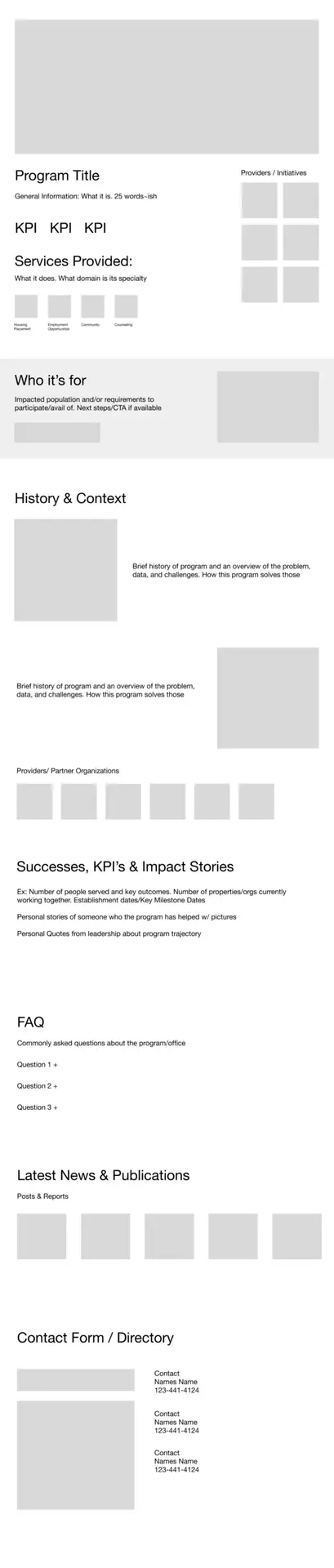
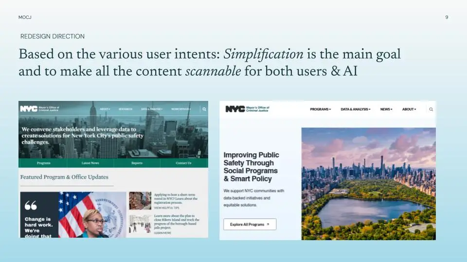
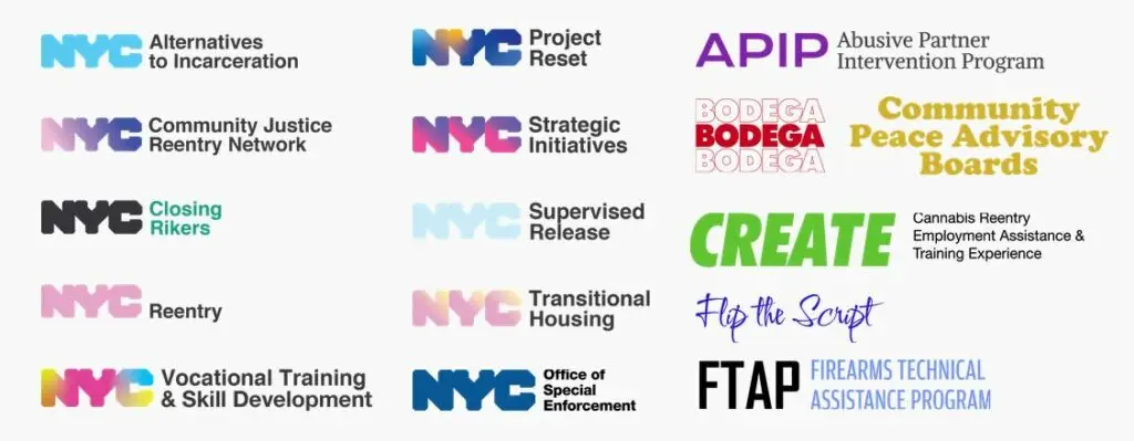
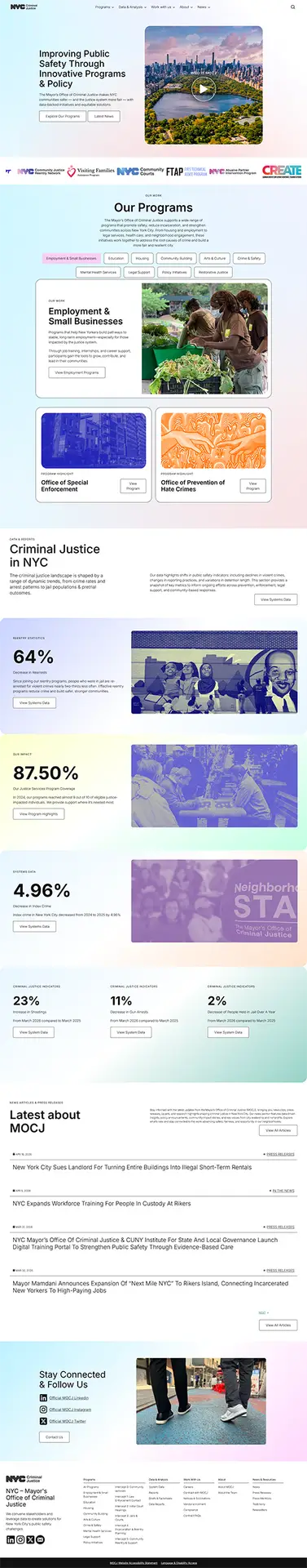
Identifying the Programs page as the core CTA. Within the leeway I had on what to emphasize, the biggest editorial decision was treating the Programs section as the site’s primary call to action. MOCJ’s value to the public isn’t abstract policy. It’s the concrete services and initiatives the office runs. I rebuilt that section as the most prominent destination on the site and gave each program its own visual brand so they read as distinct, ownable initiatives rather than generic agency programs.
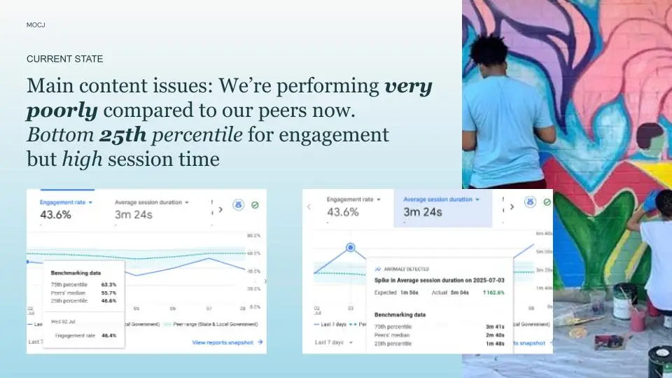
Build, accessibility, and migration. Development was a custom WordPress theme on WP Engine, with WCAG 2.x remediation running in parallel with build rather than as a post-launch pass, which is the only way to do it well. The build also had to navigate where WordPress as a platform is heading. Rather than retrofitting the old theme, I built a new one from scratch and moved the entire site onto the block builder, aligning MOCJ with WordPress’s long-term direction while keeping content editing robust and flexible for non-technical staff. To make that workable for the team day-to-day, I built a library of reusable templates, blocks, and pages, and produced documentation on how to create content and assemble new blocks. On the migration side, MOCJ had a substantial archive of policy documents, press releases, and legacy initiatives that couldn’t 404, so I mapped every URL on the old site, set up redirects for every change, and verified post-launch that indexed pages were retained. That care is one reason the SEO numbers held and then grew rather than collapsing.
Comparing the first ~6 months post-launch (Jan 1 to May 12, 2026) against the equivalent window a year prior:
The biggest thing I’d do differently in hindsight is push harder on the research and policy content from day one. I made a deliberate choice to prioritize Programs and visible public outreach, which the numbers vindicated, but it meant the research and policy areas got less of my attention than they could have. Some of that was outside my control: a leadership change late in the project shifted the policy direction, and some content didn’t make the launch window… but I could have been more proactive about giving those teams structural scaffolding earlier, so their content was ready to drop in when their direction settled. The data and research side especially has room for more depth now that the foundation is in place, and pushing harder on it would have made the site stronger out of the gate, not just structurally future-proof.
The broader principle this work reinforced for me is that public-sector platforms reward the practitioner who builds for every audience the site has to serve, not just the audience whose CTA is easiest to measure. That’s the framing I want to bring into the next phase of my work: more government, civic tech, and foundation projects where the same instincts apply.


